This article breaks down a stationery journal app built with Flutter for OpenHarmony. It covers template browsing, asset discovery, sticker creation, and profile features, while addressing common challenges such as slow OpenHarmony cross-platform delivery, disorganized state management, and complex editing interactions. Keywords: Flutter for OpenHarmony, Provider, MVVM.
Technical specifications define the project baseline
| Parameter | Description |
|---|---|
| Programming Language | Dart |
| Runtime Platforms | OpenHarmony / Android / iOS |
| UI Framework | Flutter for OpenHarmony |
| Architecture Pattern | MVVM |
| State Management | Provider |
| Network Protocols | HTTP/HTTPS |
| Core Dependencies | flutter, provider, http, cupertino_icons |
| Repository | https://atomgit.com/maaath/stationery_app |
| Stars | Not provided in the source |
This project demonstrates a repeatable path for OpenHarmony cross-platform delivery
This is a utility app designed for journal creation scenarios, with four core modules: templates, assets, creation, and profile. Its value is not the business domain itself, but the fact that it uses one Flutter codebase to cover both OpenHarmony and traditional mobile platforms.
For developers, the real pain points are usually not UI rendering. They are multi-platform adaptation, state consolidation, list performance, and interaction consistency. This project uses MVVM + Provider to clearly separate UI, data, and business state.
The feature set can be abstracted into four capability layers
- Template module: category browsing, pull-to-refresh, paginated loading
- Asset module: aggregated content such as stickers, backgrounds, and fonts
- Creation module: canvas editing, sticker placement, animation feedback
- Profile module: user information, work statistics, feature entry points
const modules = {
  'templates': 'Template browsing and paginated loading', // List-based content distribution
  'materials': 'Asset categorization and search',   // Resource supply layer
  'creation': 'Canvas editing and sticker interactions', // Core creation experience
  'profile': 'User information and work management',  // Account and retention capabilities
};
This code uses a minimal structure to describe the app’s four business domains.
Project initialization and dependency choices define the ceiling for future expansion
The project creates an OpenHarmony-enabled app directly through the Flutter CLI. This is the starting point for cross-platform consistency. Compared with adding platform adaptation later, explicitly targeting ohos during initialization makes the directory layout and build flow more stable.
flutter create --platforms=ohos stationery_appThis command creates a Flutter project scaffold with OpenHarmony platform support.
At the dependency level, a restrained setup is enough: provider handles state management, http handles remote data, and cupertino_icons supplements basic icons. For a sample app, this combination is lightweight and easy to migrate into a production project.
dependencies:
  flutter:
    sdk: flutter
  cupertino_icons: ^1.0.6
  http: ^1.2.0
  provider: ^6.1.1
These dependencies cover the three most fundamental capability areas: UI, networking, and state.
The directory structure reflects a layered design mindset
Under lib, the code is organized into models, services, viewmodels, and pages. That shows the author did not pile business logic into UI pages. For OpenHarmony cross-platform projects, this structure directly affects future plugin replacement costs and testing effort.
Data model design decouples page rendering from business evolution
The project defines four core entities: Template, Material, Sticker, and Creation, corresponding to templates, assets, stickers, and user works. The models are not complex, but the field selection covers key requirements such as card rendering, search categories, favorite state, and composition for creation.
class Template {
  final String id;
  final String title;
  final String thumbnail;
  final String category;
  final String author;
  final int likes;
  final bool isFavorite;

  Template({
    required this.id,
    required this.title,
    required this.thumbnail,
    required this.category,
    required this.author,
    required this.likes,
    required this.isFavorite,
  });
}
This model carries the minimum closed-loop data needed to render template list cards.
Enums and composite objects improve maintainability
The MaterialType enum prevents string literals from spreading across the codebase. Creation holds a list of Sticker objects, which naturally combines a work with its decorative assets. If a real backend is introduced later, you only need to add serialization logic for a smooth evolution path.
Separating the service layer from the state layer improves testability
The networking layer, NetworkService, is responsible only for data fetching and does not care about UI state. Although the sample returns mock data, the API signature is already close to a real project, which means switching to live APIs later will be low-cost.
class NetworkService {
  Future<List<Template>> getTemplates(int page, int pageSize) async {
    return _getMockTemplates(page, pageSize); // Use mock data instead of a real API
  }
}
This service code reflects an engineering approach: stabilize the interface first, then replace the data source.
The Provider layer handles loading state, pagination boundaries, and refresh logic. loadTemplates processes initial load, refresh, and incremental pagination in one place, making it the key state convergence point for the list page.
class TemplateViewModel extends ChangeNotifier {
  bool _isLoading = false;
  bool _hasMore = true;
  int _currentPage = 1;

  Future
<void> loadTemplates({bool refresh = false}) async {
    if (_isLoading) return; // Prevent duplicate requests
    if (!refresh && !_hasMore) return; // Stop pagination when no more data is available
  }
}
This logic ensures that paginated requests do not re-enter and do not trigger meaningless infinite-scroll loading.
The UI design focuses on high-frequency interactions instead of simple page stacking
The main page uses BottomNavigationBar + IndexedStack. This is not just a basic navigation choice. It preserves tab state and avoids rebuilding the template list and creation canvas every time the user switches tabs.
body: IndexedStack(
  index: _currentIndex,
  children: _pages, // Keep each page state alive
)
The core value of IndexedStack is that it does not destroy child page state during tab switching.
The template page reflects a standard implementation pattern for list-driven apps
The template page combines a horizontal category bar, RefreshIndicator, a two-column GridView, and Consumer-based data listening. This structure fits content distribution apps very well and can also be migrated to e-commerce, galleries, news, and similar scenarios.
The creation page is the most technically substantial part of the implementation
The creation page uses Stack + Positioned to build a freely arranged canvas, then adds bounce effects to animated stickers through AnimationController and Tween. This implementation shows that Flutter for OpenHarmony can support not only ordinary form pages, but also lightweight graphical interactions.
void _addSticker(Sticker sticker) {
  final placedSticker = PlacedSticker(
    id: '${sticker.id}_${DateTime.now().millisecondsSinceEpoch}', // Generate a unique instance ID
    sticker: sticker,
    x: 150,
    y: 200,
  );

  setState(() {
    _placedStickers.add(placedSticker); // Place the sticker on the canvas
  });

  if (sticker.isAnimated) {
    _bounceController.forward(from: 0); // Trigger bounce animation for animated stickers
  }
}
This code completes three key actions: sticker instantiation, placement initialization, and animation triggering.
The canvas interaction proves Flutter’s rendering consistency on OpenHarmony
In the sample, stickers are represented by color blocks and emoji instead of real assets, but the architecture already has room to grow. With further extension, you can add drag, scale, rotate, layer ordering, and local persistence to gradually approach full editor capabilities.
Runtime validation shows that this approach is usable on real devices
The original article includes three screenshots from OpenHarmony devices, corresponding to the template page, asset page, and creation page.
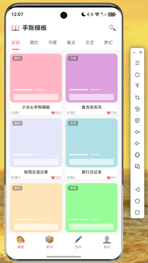 AI Visual Insight: This image shows a content distribution interface that combines a two-column template card layout, top category switching, and bottom navigation. The card thumbnails maintain a consistent aspect ratio, which suggests that the grid constraints and
 childAspectRatio were tuned precisely for dense visual content browsing.
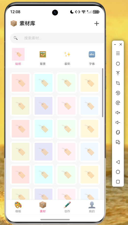 AI Visual Insight: This image shows a categorized presentation of content assets, emphasizing scanability and filtering efficiency for asset entry points. The layout likely uses a hybrid list or grid structure, making it suitable for future expansion with search, tag filtering, and lazy-loading strategies.
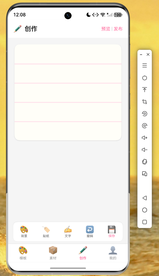 AI Visual Insight: This image highlights a three-part editing layout composed of a canvas area, decorative sticker elements, and an action bar. The rendered result shows that layered
 Stack composition, Positioned placement, and localized animation effects remain stable on OpenHarmony devices, providing a solid foundation for more advanced gesture-based editing.
The performance metrics are also pragmatic: startup time is under 2 seconds, scrolling reaches 60 FPS, and page switching shows no obvious jank. For a lightweight to midweight content app, this is already sufficient to support MVP delivery.
Three boundary conditions still matter before deploying to OpenHarmony
- Complete signing configuration in DevEco Studio
- Declare OpenHarmony permissions for network access
- Carefully evaluate OpenHarmony compatibility for third-party plugins
This implementation works best as a reference skeleton for Flutter on OpenHarmony
If your goal is to quickly validate an OpenHarmony commercial prototype, this project provides a reliable template: clear initialization, explicit architectural layering, complete interaction samples, and useful performance results. Compared with abstract discussions about framework advantages, it is much closer to a reusable engineering starter.
As next steps, prioritize real APIs, authentication, image caching, cloud storage for works, and a gesture system for the editor. Once those are in place, the project can evolve from a demo app into an operable product.
FAQ
1. Is Flutter for OpenHarmony suitable for production projects?
Yes, for small to medium-sized content apps, utility apps, and prototype validation. The prerequisite is to confirm that your critical plugins work on OpenHarmony, especially for notifications, storage, location, and authentication-related capabilities.
2. Why use Provider here instead of GetX or Bloc?
Because Provider is lightweight and better matched to the complexity of this sample project. For requirements such as template loading, refresh pagination, and page-level listening, it can consolidate state with lower cognitive overhead.
3. How can this journal app be enhanced further?
Start by adding real content assets, drag/scale/rotate gestures, work save and sync, image caching, and user authentication. If you continue to deepen the implementation, it can evolve into a full cross-platform rich media editor.
Core summary
This article reconstructs a practical stationery journal app built with Flutter for OpenHarmony, covering project initialization, MVVM layering, data models, Provider state management, a template grid page, a sticker-based creation page, OpenHarmony runtime validation, and performance characteristics. It is a strong fit for developers who want to ship OpenHarmony cross-platform apps quickly.