This article focuses on high-frequency Element Plus component usage in Vue 3. It systematically explains how to implement state switching, selection input, feedback messaging, and data display scenarios, helping reduce fragmented component choices, API memorization overhead, and the gap between examples and real-world implementation. Keywords: Vue 3, Element Plus, UI components.
Technical Snapshot
| Parameter | Description |
|---|---|
| Core Technologies | Vue 3, Element Plus, JavaScript |
| Component Categories | Form Input, Feedback Messaging, Data Display, Layout and Navigation |
| Runtime Pattern | Component templates + script setup |
| License Information | The original page is marked CC 4.0 BY-SA |
| Star Count | Not provided in the original content |
| Core Dependencies | vue, element-plus |
Element Plus covers high-frequency business UI requirements in Vue 3
Element Plus is a mature desktop UI component library in the Vue 3 ecosystem. It works especially well for admin systems, content platforms, academic management systems, and operations dashboards. Its advantage does not come from any single component, but from its unified interaction semantics and low page assembly cost.
Based on the original content, this article focuses on four capability areas: state switching, pickers, feedback messaging, and data display. Together, these four categories form the interaction backbone of most admin and back-office pages.
Switch and slider components are ideal for bounded states and continuous values
el-switch is designed for boolean or two-state values, such as enabled/disabled or member/non-member. el-slider is useful for progress, ratings, thresholds, and range selection, especially when the input is a continuous value.
<script setup>
import { ref } from 'vue'

const isVip = ref(true)
const percent = ref(50)
const formatTooltip = (value) => `${value}%` // Format slider tooltip text
</script>

<template>
  <el-switch
    v-model="isVip"
    active-text="Member"
    inactive-text="Non-member"
    active-color="#13ce66"
    inactive-color="#ff4949"
  />

  <el-slider
    v-model="percent"
    :step="10"
    :show-stops="true"
    :format-tooltip="formatTooltip"
  />
</template>
This example demonstrates how to combine a state switch with a slider that uses discrete step values.
 AI Visual Insight: The image shows several
 el-switch instances displayed side by side, including custom active/inactive labels, loading states, and disabled states. This demonstrates that the component can express both visual state and business semantics in sync.
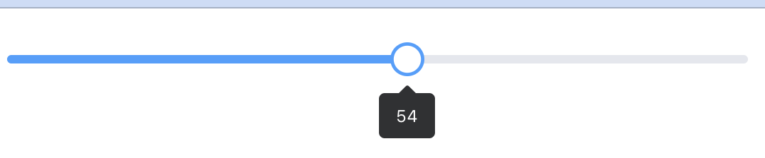 AI Visual Insight: The image shows the single-value drag behavior of a basic
 el-slider, with linked tooltip and track interaction. It is well suited for continuous input in a 0-100 range.
Picker components make time, date, and color input more controllable
The time picker el-time-picker, date picker el-date-picker, and color picker el-color-picker all turn complex input into structured selection, reducing validation overhead for input formats.
In business scenarios, time ranges work well for scheduling, appointments, and report filters. Date ranges are ideal for querying. Color selection is useful for theme configuration, label management, and style editors.
<script setup>
import { ref } from 'vue'

const timeRange = ref([])
const dateRange = ref([])
const color = ref('rgba(64, 158, 255, 1)')
</script>

<template>
  <el-time-picker
    v-model="timeRange"
    :is-range="true"
    range-separator="~"
    start-placeholder="Start time"
    end-placeholder="End time"
  />

  <el-date-picker
    v-model="dateRange"
    type="daterange"
    range-separator="to"
    start-placeholder="Start date"
    end-placeholder="End date"
  />

  <el-color-picker v-model="color" :show-alpha="true" />
</template>
This example shows the basic integration pattern for three types of pickers in structured input scenarios.
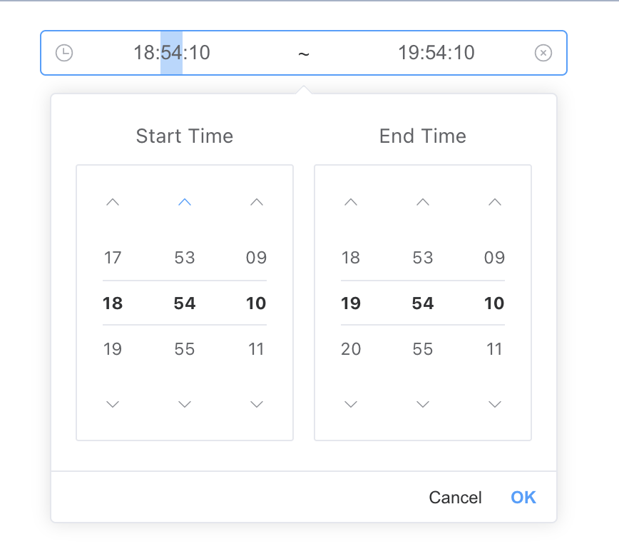 AI Visual Insight: The image shows a range-based time selection panel. The left and right columns are used to select start and end times, and the input field is linked to the panel. This fits time-window filtering and appointment workflows.
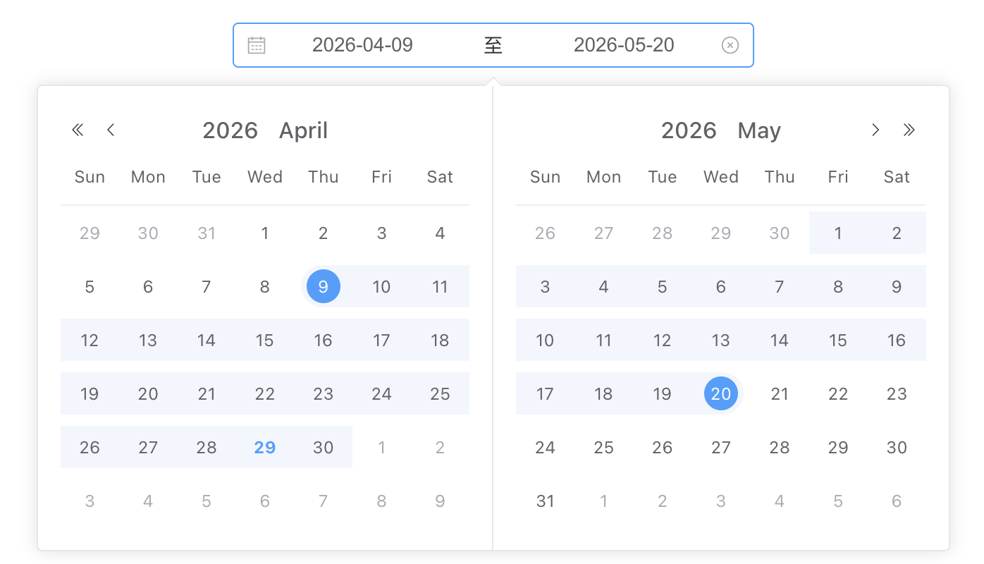 AI Visual Insight: The image shows a dual-calendar date range panel that supports selecting start and end dates across months. It is a strong fit for typical back-office filtering scenarios such as orders, logs, and report queries.
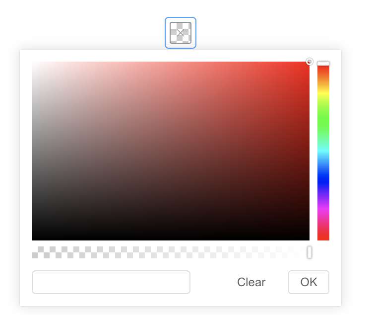 AI Visual Insight: The image shows a color panel with a hue bar, alpha slider, and color preview area, indicating that the component supports not only color selection but also alpha channel adjustment.
Feedback components create a clear user action loop
Element Plus feedback components can be divided into persistent alerts, transient messages, interactive dialogs, and global notifications. These are not interchangeable. They are interaction tools at different layers.
el-alert is suitable for static risk notices. ElMessage works well for lightweight result feedback. ElMessageBox fits confirmation, input, and blocking interactions. ElNotification is appropriate for system-level reminders.
<script setup>
import { ElMessage, ElMessageBox, ElNotification } from 'element-plus'

const openMessage = () => {
  ElMessage({ message: 'Saved successfully', type: 'success' }) // Lightweight success feedback
}

const openConfirm = () => {
  ElMessageBox({
    title: 'Notice',
    message: 'Are you sure you want to delete the current record?',
    type: 'warning',
    showCancelButton: true
  })
}

const openNotify = () => {
  ElNotification({
    title: 'System Notification',
    message: 'A new task has been assigned',
    type: 'info'
  })
}
</script>
This example summarizes the typical invocation patterns for messages, dialogs, and notifications across three feedback layers.
 AI Visual Insight: The image shows top-floating message bars with short-lived display and automatic dismissal. This makes them suitable for immediate feedback such as save success or validation failure.
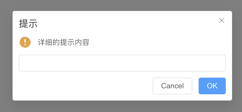 AI Visual Insight: The image shows a modal dialog with a title, body content, input area, and confirm/cancel buttons, indicating that
 ElMessageBox can handle both confirmation and input collection.
Data-bearing components support the core structure of admin systems
At the data presentation layer, el-table is the most important component. At the page organization layer, el-menu, el-tabs, el-drawer, and el-container together form the structural backbone for navigation, view switching, overlays, and layout.
Tables carry structured data. Menus drive page routing. Tabs switch between module views. Drawers support side-panel editing. Container components arrange headers, sidebars, content areas, and footers.
<script setup>
const tableData = [
  { name: 'Xiao Wang', age: 29, subject: 'Java' },
  { name: 'Xiao Li', age: 30, subject: 'C++' },
  { name: 'Xiao Zhang', age: 28, subject: 'JavaScript' }
]
</script>

<template>
  <el-table :data="tableData" stripe border>
    <el-table-column prop="name" label="Name" />
    <el-table-column prop="age" label="Age" />
    <el-table-column prop="subject" label="Subject" />
  </el-table>
</template>
This example shows the most common table rendering pattern used on admin list pages.
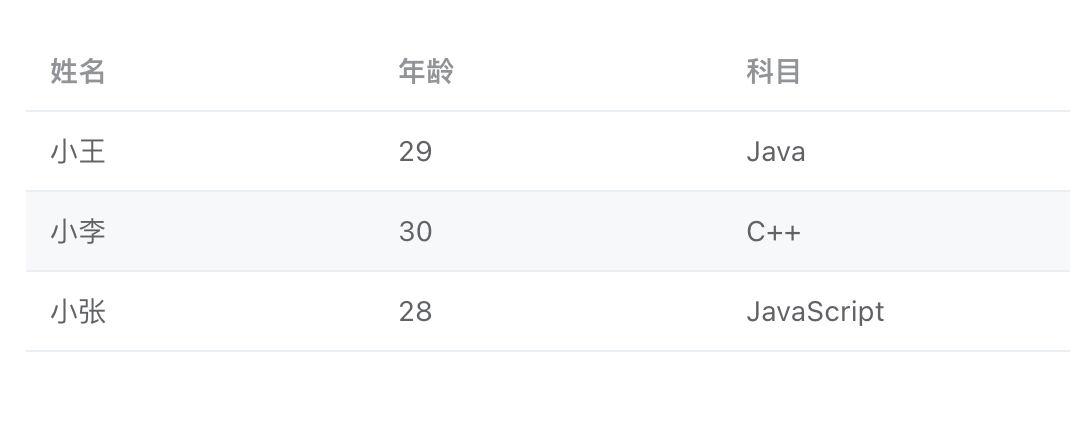 AI Visual Insight: The image shows a three-column table with clearly separated headers, row data, and borders, demonstrating that
 el-table already provides the foundational data presentation capabilities required by admin dashboards.
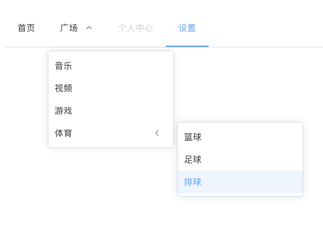 AI Visual Insight: The image shows horizontal navigation with multi-level dropdown submenus, indicating that
 el-menu supports hierarchical navigation, disabled items, and top-level navigation mode.
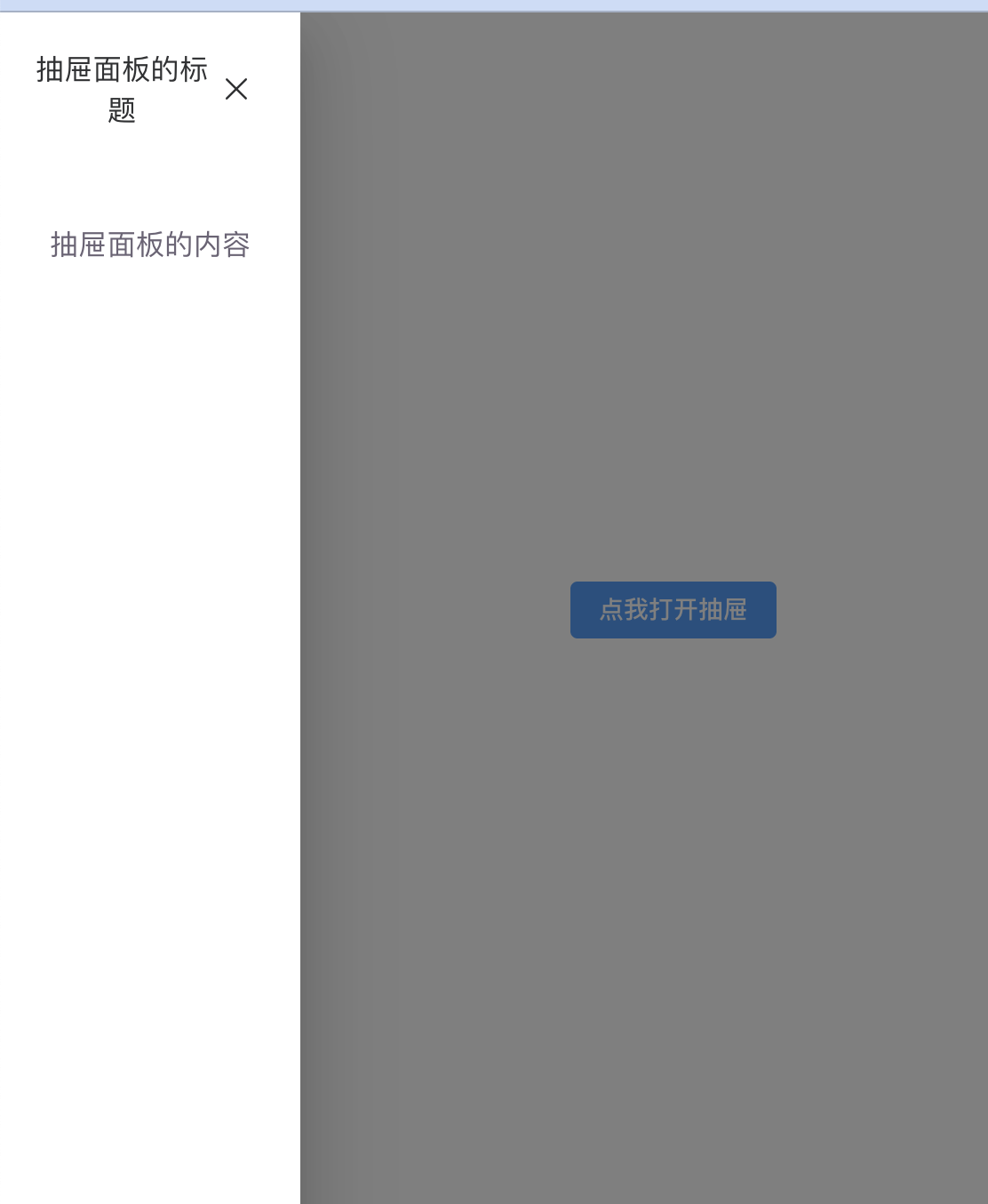 AI Visual Insight: The image shows a left-side drawer panel sliding over the main page while preserving page context, making it suitable for detail viewing and partial editing scenarios.
Combined examples show these components are effective for rapidly building admin systems
The original content provides two typical examples: a student management page in an academic administration system, and a simple user list with add/delete operations. The first highlights the combination of layout, menu, and table. The second demonstrates the minimum interaction loop built from a table and action buttons.
In real projects, a recommended page structure is: filter area + action area + table area + detail drawer area. Then use messages and notifications to complete the feedback loop. This structure maps closely to common admin engineering practice.
<script setup>
import { ref } from 'vue'

const users = ref([
  { name: 'Zhang San', age: 20 },
  { name: 'Li Si', age: 25 }
])

const addUser = () => {
  users.value.push({ name: 'New User', age: 30 }) // Append a new record to the reactive array
}

const deleteUser = (index) => {
  users.value.splice(index, 1) // Remove the specified user by index
}
</script>
This code provides the minimum viable logic for adding and removing items from a user list.
Component selection and state boundaries should be the first development priority
Use el-switch for binary state. Use el-slider for continuous or range-based values. If an input has built-in format constraints, prefer a picker over a plain text input.
For feedback hierarchy, do not use a modal for every successful save, and do not rely on a lightweight message alone for dangerous operations. The more accurately you choose components, the lower the cognitive load of the page and the lower the operational cost for users.
FAQ
Q: How should I choose between ElMessage and ElNotification in Element Plus?
A: ElMessage is better for brief, lightweight, immediate post-action feedback. ElNotification is better for system-level reminders that stay visible longer and appear in a fixed position.
Q: When should I use el-drawer versus ElMessageBox?
A: Use el-drawer when you need to display richer forms or detailed content. Use ElMessageBox when you only need confirmation, warning, or simple input in a lighter interaction flow.
Q: Why is el-table usually the first choice for admin list pages?
A: Because it natively supports capabilities such as column definitions, sorting, filtering, zebra striping, fixed headers, and expandable rows, which cover most back-office data presentation requirements.
Core Summary: This article reorganizes the core usage patterns of Element Plus components in Vue 3, covering switches, sliders, time/date/color pickers, messages, notifications, tables, menus, tabs, drawers, and layout containers, along with practical examples and common development recommendations.