Technical Specification Snapshot
| Parameter | Description |
|---|---|
| Programming Language | Dart |
| UI Framework | Flutter for OpenHarmony |
| Target Platform | OpenHarmony |
| Network Protocol | HTTP/HTTPS |
| State Organization | StatefulWidget, extensible to Provider |
| Core Dependencies | flutter, dio, material |
| Code Repository | https://atomgit.com/maaath/flutter_news_app |
| Source Article Type | CSDN hands-on project adaptation |
This project fully covers the core interaction flow of a news app
This article breaks down a news application built with Flutter for OpenHarmony. It focuses on network requests, list pagination, bottom navigation, detail page animations, and image preview, addressing how to take a cross-platform OpenHarmony app from structural design to coordinated multi-page interactions. Keywords: Flutter for OpenHarmony, Dio, news app.
This project centers on a news and information use case and combines home channel switching, news lists, detail reading, search entry, and a profile center. Its value does not lie in any single page. Instead, it demonstrates how Flutter for OpenHarmony organizes pages in a real-world application.
For developers, the real challenge is usually not whether they can build a page, but how to reliably connect network requests, paginated loading, route animations, and image interactions in an OpenHarmony environment. This case provides a reusable engineering path.
The recommended directory structure should be established before page development begins
The project uses a five-layer structure: model, service, pages, widgets, and utils. This design separates responsibilities across data models, networking logic, page views, and shared components, so adding channels, favorites, or history later does not require broad refactoring.
lib/
├── main.dart              // App entry point
├── model/                 // Data model layer
├── service/               // Network service layer
├── pages/                 // Page layer
├── widgets/               // Reusable component layer
└── utils/                 // Utility function layer
This structure defines a typical layered Flutter skeleton and works well as a starter template for OpenHarmony cross-platform projects.
Data model resilience determines the cost of API adaptation
The NewsModel is more than a field container. It also handles API compatibility. In the original implementation, fromJson supports multiple backend field names such as title, desc, pic, and time, which significantly reduces the risk of parsing failures caused by inconsistent APIs.
At the same time, toJson() gives the model persistence potential, so you can later add local cache, favorites, or offline reading without redesigning the model layer.
factory NewsModel.fromJson(Map<String, dynamic> json) {
  return NewsModel(
    title: json['title'] ?? '', // Fallback for title fields
    content: json['content'] ?? json['desc'] ?? '', // Fallback for content sources
    imageUrl: json['imageUrl'] ?? json['pic'] ?? '', // Fallback for image fields
    publishTime: json['publishTime'] ?? json['time'] ?? '', // Fallback for time fields
  );
}
The core purpose of this code is to provide fallback handling for API fields and reduce the impact of backend differences on the frontend.
Dio network encapsulation must consider both OpenHarmony compatibility and fallback strategy
The project uses Dio to centrally configure baseUrl, timeouts, headers, and interceptors. What makes this implementation worth borrowing is not simply that it uses Dio, but that it falls back to mock data through _getMockNews() after failures, ensuring UI debugging and development can continue even without network access.
This design is especially practical for Flutter for OpenHarmony. During OpenHarmony integration, permissions, certificates, gateways, or API stability can all affect request results. Preparing fallback data in advance can significantly improve development efficiency.
final response = await _dio.get(
  '/m热点新闻',
  queryParameters: {
    'type': 'json',
    'page': page, // Page number parameter
  },
);
if (response.statusCode == 200) {
  // Perform business parsing only after a successful request
  return list.map((item) => _convertToNews(item, category)).toList();
}
return _getMockNews(category, page); // Fall back to mock data on failure
This wrapper solves three problems at once: API calls, result transformation, and failure fallback.
Home navigation and channel switching rely on state preservation
The home page organizes four channels through BottomNavigationBar + PageView: Headlines, Technology, Sports, and Mine. The key is not the tab switch itself, but the combination of NeverScrollableScrollPhysics and PageController.animateToPage, which ensures that switching is driven entirely by the bottom navigation.
If you rebuild pages too frequently, list scroll positions and loading states are easy to lose. The current implementation preserves page instances through a PageView container, which fits the high-frequency switching pattern of news apps.
void _switchTab(int index) {
  setState(() {
    _currentIndex = index; // Update the currently selected tab
  });
  _pageController.animateToPage(
    index,
    duration: const Duration(milliseconds: 200),
    curve: Curves.easeOut,
  );
}
This code centrally drives both navigation state and animated page transitions.
The key to list page performance is a complete loop for refresh, pagination, and empty states
The news list page integrates RefreshIndicator, ScrollController, and ListView.builder. Together, they form the standard trio of an information-feed page: initial load, pull-to-refresh, and infinite scroll.
The most valuable engineering detail here is boundary-state handling: _isLoading prevents re-entry, _hasMore controls when pagination stops, and empty-state placeholders appear when no data is available. These details prevent duplicate requests and user confusion, and they mark the difference between production code and simple demos.
void _onScroll() {
  if (_scrollController.position.pixels >=
      _scrollController.position.maxScrollExtent - 200) {
    _loadMore(); // Trigger paginated loading when close to the bottom
  }
}
This listener implements the trigger condition for infinite scrolling.
The detail page improves reading immersion through animations and image preview
The detail page uses a FadeTransition + SlideTransition combination to make page entry feel more natural. Beyond the article body, it also supports related image lists, full-screen viewing, and InteractiveViewer zooming and dragging. As a result, it is not just an article page, but something closer to a production-grade content reading page.
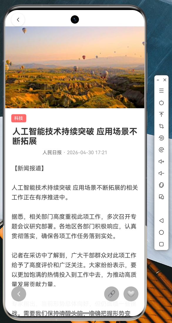 AI Visual Insight: This interface shows the complete reading layout of the news detail page: a large hero image at the top with an overlaid back button, a middle section containing the category tag, title, author, and publish time, and a content area below. The overall card-based spacing and vertical scrolling structure suggest an implementation based on
 CustomScrollView or an equivalent segmented layout, emphasizing immersive reading and strong media support.
_fadeAnimation = Tween
<double>(begin: 0.0, end: 1.0).animate(
  CurvedAnimation(parent: _animationController, curve: Curves.easeOut),
);
_slideAnimation = Tween
<Offset>(
  begin: const Offset(0, 0.05), // Slight downward offset at the start
  end: Offset.zero,
).animate(CurvedAnimation(parent: _animationController, curve: Curves.easeOut));
This animation setup delivers a fade-in effect combined with subtle motion when the detail page enters.
Runtime screenshots confirm that the interaction design covers the main usage scenarios
The splash page uses a gradient background and logo scaling to strengthen brand recognition.
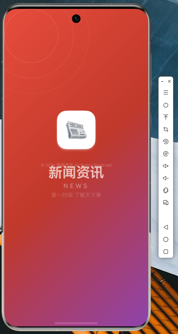 AI Visual Insight: The image shows a branded splash screen design: a centered icon container combined with a large title and a gradient background, which is a typical Splash Screen pattern. Technically, it usually relies on
 AnimationController to drive scale and opacity changes, then navigates to the home page after a delay to complete the cold-start visual transition.
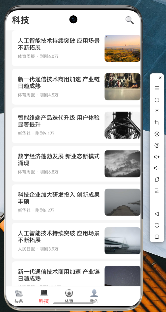
The list page uses a mixed layout with a featured hero card at the top and standard cards below, which helps surface trending content more effectively.
 AI Visual Insight: This screenshot shows the two-layer information structure of the news feed home page: a high-priority featured banner at the top and a standard image-and-text list below. The interface suggests the implementation includes featured-news detection, network image loading, time formatting, and lazy list rendering, matching a typical first-screen layout for content feed apps.
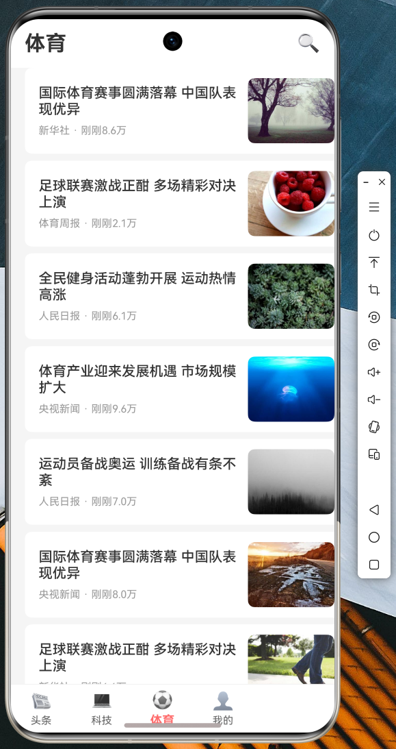
Bottom navigation switching demonstrates the multi-channel structure and consistent visual feedback.
 AI Visual Insight: This image reflects the state-switching effect of a four-tab bottom navigation bar, where the current channel is highlighted and the others are muted. This design is typically implemented by linking
 BottomNavigationBar with PageView, with emphasis on state preservation, click transition animations, and safe area adaptation.
 AI Visual Insight: This screenshot further shows that content pages across different channels already share a unified container structure. The top title and bottom navigation remain fixed, while the center content changes by channel. This indicates the project is ready for channel-based expansion, where adding a new category only requires a new data source and page-instance mapping.
Search and the profile center also form a complete interaction loop.
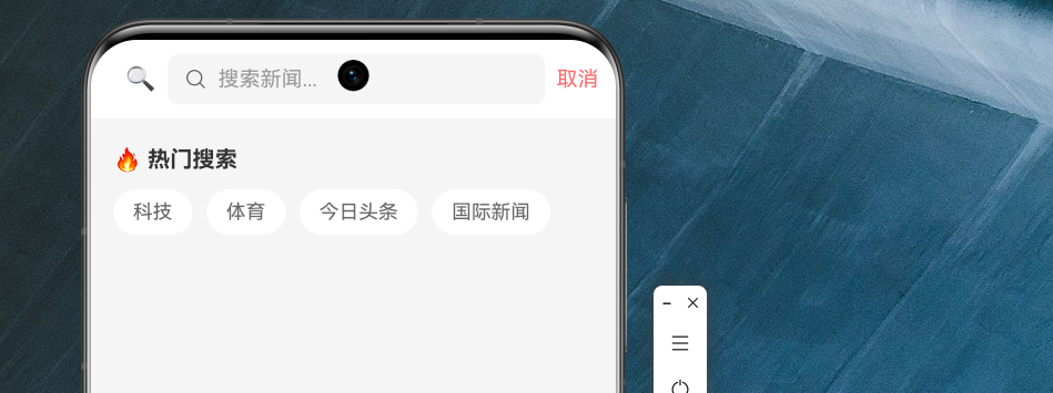 AI Visual Insight: This page shows the search module with an input area, popular search terms, and a history section. It indicates that search is not just a simple input-and-jump flow, but includes recommended terms and accumulated user behavior. In implementation terms, it usually requires local storage for historical keywords and supports quick tap-to-fill interactions that trigger queries.
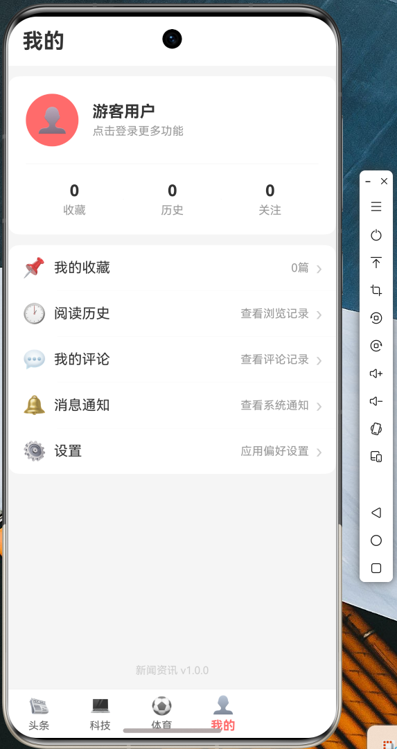 AI Visual Insight: This screenshot highlights the card-based information architecture of the profile page: an avatar and user information at the top, statistics in the middle, and a list of feature entry points at the bottom. Technically, this implies a multi-section scroll layout and a unified menu component design, which is suitable for extending account-domain capabilities such as favorites, history, messages, and settings.
The entry file should unify theme, routing, and system styles
main.dart handles status bar styling, global themes, named routes, and splash-page navigation. For OpenHarmony scenarios, this step reduces visual inconsistency across pages and makes it easier to add dark mode or brand color schemes later.
void main() {
  WidgetsFlutterBinding.ensureInitialized();
  SystemChrome.setSystemUIOverlayStyle(
    const SystemUiOverlayStyle(
      statusBarColor: Colors.transparent, // Transparent status bar
      statusBarIconBrightness: Brightness.dark,
    ),
  );
  runApp(const MyApp());
}
This entry-point code completes Flutter initialization and unifies system UI styling.
This case works well as a mid-sized Flutter for OpenHarmony project template
If you are migrating a Flutter project to OpenHarmony, this case is most valuable in three areas: a clear structure, a complete page interaction chain, and coverage of the key interactions found in real list-based applications.
For further expansion, prioritize adding Provider or Riverpod state management, local caching, favorites persistence, API authentication, and analytics instrumentation. That will help the project evolve from a teaching demo into a sustainable business foundation.
FAQ
1. Why should a Flutter for OpenHarmony project keep mock data?
Because network permissions, API availability, and certificate issues are common during OpenHarmony integration. Mock data allows page development, UI debugging, and interaction validation to continue without being blocked by the backend.
2. Why is `ScrollController` recommended for a news list instead of button-based pagination?
Because content-feed scenarios are better suited to continuous reading. ScrollController can automatically trigger pagination when the user approaches the bottom, which feels more natural and better matches the behavior users expect from content distribution apps.
3. What should be strengthened first before this project goes to production?
Prioritize state management, error monitoring, local caching, and API authentication. The current example already provides a page skeleton, but a production environment still requires stronger data consistency and more reliable exception recovery.
Core Summary: This article reconstructs a practical news app example built with Flutter for OpenHarmony. It covers layered architecture, Dio network encapsulation, list refresh and loading, bottom navigation, detail page animations, image preview, and route configuration, making it a strong engineering reference for OpenHarmony cross-platform app development.