This article walks through a complete Flutter search component implementation for OpenHarmony 1.0.0. The core capabilities include real-time filtering, keyword highlighting, empty-state feedback, and list item interaction. It addresses weak cross-platform search experiences and limited code reuse. Keywords: Flutter, OpenHarmony, search highlighting.
This solution provides a Flutter search component designed for OpenHarmony
| Parameter | Description |
|---|---|
| Language | Dart / Flutter |
| Target Platform | OpenHarmony 1.0.0 |
| Interaction Model | Local real-time search |
| Core Capabilities | Real-time filtering, keyword highlighting, empty-state feedback |
| State Management | StatefulWidget + setState |
| Key Widgets | TextField, ListView.builder, RichText |
| Core Dependency | flutter/material.dart |
| Star Count | Not provided in the source |
This solution is essentially a pure Dart search page that does not depend on native platform APIs, which makes it highly stable for OpenHarmony adaptation. For small and medium-sized datasets, you can directly use it in tools, content, product, and contact search scenarios.
This component primarily solves search experience and cross-platform reuse problems
Traditional list pages usually suffer from three common issues: slow feedback after input, unclear match results, and no explicit feedback when nothing matches. This solution completes filtering logic, text highlighting, and empty-state rendering within a single page, which reduces both development and maintenance complexity.
For Flutter for OpenHarmony projects, this kind of “pure UI + pure logic” component is especially suitable for early migration. Because it barely involves channel communication, permission requests, or device capability access, it maximizes reuse of existing Flutter code.
The screenshot shows the relationship between the search box, result list, and highlighted matches
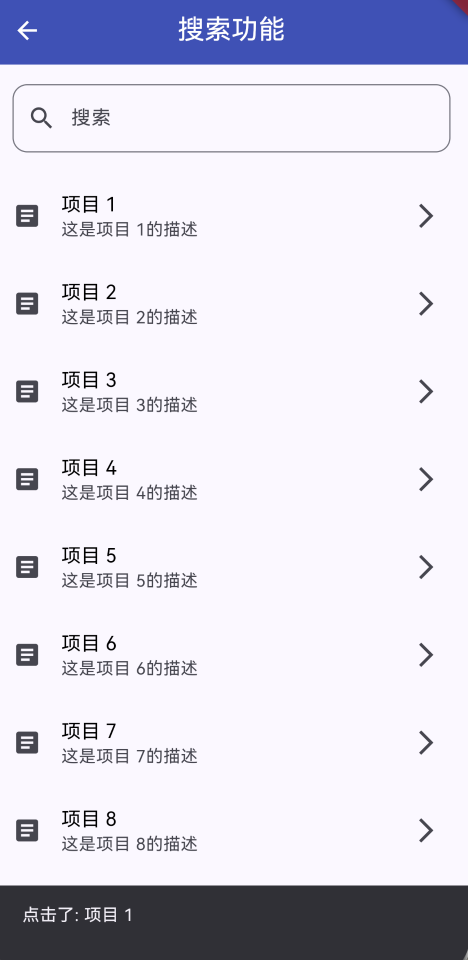
AI Visual Insight: The image shows a typical mobile search page: a search input field with a search icon at the top, a vertical results list in the middle, and matched keywords highlighted with a high-contrast background color. The overall design uses card-style list items and clean whitespace, indicating that the component focuses on fast input feedback, result readability, and clear empty-state messaging.
The feature set can be broken down into four independent capabilities
- Real-time search: input changes trigger filtering immediately.
- Keyword highlighting: matched text fragments render with a distinct style.
- Clear input: a trailing action button restores the full list with one tap.
- Empty-state feedback: the UI shows explicit feedback when no items match.
final TextEditingController _searchController = TextEditingController();
final List
<String> _allItems = List.generate(50, (index) => 'Item ${index + 1}');
List
<String> _filteredItems = [];
This code defines the search input controller, the original dataset, and the filtered result set. Together, they form the minimum data foundation for the component.
A single-page state model is enough to cover the core requirements
You can divide the page structure into three layers: the input layer, the result layer, and the business logic layer. The input layer captures the query, the result layer renders the list, and the business logic layer handles filtering and highlighting. Because the state is simple, StatefulWidget is sufficient.
The overall structure can be summarized as input-driven rendering
UI Layer
├── TextField             # Captures the search keyword
├── ListView.builder      # Renders the result list
State Layer
└── StatefulWidget        # Updates page state
Logic Layer
├── _filterItems()        # Filters the results
└── _highlightText()      # Highlights matched text
This structure shows that the search page does not need an additional state library to deliver a stable, clear, and maintainable interaction loop.
The core implementation relies on input changes to trigger filtering updates
The key to filtering is to normalize case before calling contains. This reduces matching errors and avoids the user experience problem of “not finding content” because of case differences.
void _filterItems(String query) {
  setState(() {
    if (query.isEmpty) {
      _filteredItems = _allItems; // Fall back to the full dataset when the query is empty
    } else {
      _filteredItems = _allItems
          .where((item) => item.toLowerCase().contains(query.toLowerCase())) // Case-insensitive matching
          .toList();
    }
  });
}
This code completes real-time filtering and serves as the core entry point for synchronized list updates.
The page body directly connects TextField and ListView
TextField(
  controller: _searchController,
  decoration: InputDecoration(
    labelText: 'Search',
    hintText: 'Enter a keyword to search',
    prefixIcon: const Icon(Icons.search),
    suffixIcon: _searchController.text.isNotEmpty
        ? IconButton(
            icon: const Icon(Icons.clear),
            onPressed: () {
              _searchController.clear(); // Clear the input field
              _filterItems(''); // Restore the full list
            },
          )
        : null,
  ),
  onChanged: _filterItems, // Filter immediately when input changes
)
This code turns input, clearing, and synchronized refresh into a complete interaction flow.
Keyword highlighting determines whether search results are easy to scan
Returning matched results alone is not enough. Users need to quickly understand where the match occurred. Here, RichText and TextSpan apply local style enhancements to the matched fragment, which significantly improves scanning efficiency.
List
<TextSpan> _highlightText(String text, String query) {
  if (query.isEmpty) {
    return [TextSpan(text: text)]; // Return plain text when there is no query
  }

  final lowerText = text.toLowerCase();
  final startIndex = lowerText.indexOf(query);
  if (startIndex == -1) {
    return [TextSpan(text: text)]; // Do not highlight if there is no match
  }

  final endIndex = startIndex + query.length;
  return [
    TextSpan(text: text.substring(0, startIndex)),
    TextSpan(
      text: text.substring(startIndex, endIndex),
      style: const TextStyle(
        color: Colors.indigo,
        fontWeight: FontWeight.bold,
        backgroundColor: Color(0xFFFFEB3B), // Highlight the matched fragment
      ),
    ),
    TextSpan(text: text.substring(endIndex)),
  ];
}
This code highlights the first matched fragment and works well as a starting point for visual enhancement in search results.
The empty-result state must explicitly communicate system feedback
When a search returns no results, the worst user experience is a page that appears unresponsive. You therefore need clear empty-state copy that tells the user there are no matches instead of leaving the interface blank.
Expanded(
  child: _filteredItems.isEmpty
      ? const Center(
          child: Text(
            'No matching items found', // Clearly indicate that there are no results
            style: TextStyle(fontSize: 16, color: Colors.grey),
          ),
        )
      : ListView.builder(
          itemCount: _filteredItems.length,
          itemBuilder: (context, index) {
            return ListTile(title: Text(_filteredItems[index]));
          },
        ),
)
This code ensures that even failed searches provide clear UI feedback and do not create a sense of interaction breakdown.
When applying this in production, prioritize three categories of enhancements
The first category is performance optimization, such as adding debounce for high-frequency input and adding pagination or asynchronous filtering for larger datasets. The second category is feature enhancement, such as supporting search history, suggestion prompts, and multi-field search. The third category is experience enhancement, such as category-based sorting, Pinyin matching, and multiple-match highlighting.
If the data source comes from a remote API, upgrade local filtering to a hybrid model of “local input + remote query + cached backfill.” This approach preserves immediate responsiveness while also covering large-scale datasets.
This implementation works especially well as a base component template for Flutter on OpenHarmony
From an engineering perspective, this search page provides three major benefits: it has no platform binding and therefore low migration cost; it keeps clear boundaries between UI and logic, which makes secondary encapsulation easier; and it delivers a complete functional loop, which makes it suitable for a shared component library.
For Flutter for OpenHarmony teams, a practical next step is to abstract it into three reusable parts: SearchPanel, HighlightText, and EmptyState, then gradually connect real business data sources.
FAQ
1. Why is this search component well suited for OpenHarmony adaptation?
Because it mainly relies on standard Flutter widgets and Dart logic, it does not need to call OpenHarmony native capabilities. That gives it strong cross-platform consistency and a low adaptation cost.
2. What is the current limitation of the highlighting algorithm?
The current implementation only highlights the first matched fragment. If the text contains multiple matches, you need to switch to an iterative scan that generates multiple TextSpan objects.
3. How can you avoid lag when the dataset is very large?
Add input debounce, asynchronous filtering, paginated loading, and result caching. If the data source comes from the server, switch to API-based search and let the client focus only on rendering and partial highlighting.
Core Summary: This article reconstructs a Flutter search component solution adapted for OpenHarmony 1.0.0. It covers real-time search, keyword highlighting, empty-result feedback, list interaction, and performance optimization considerations, while also providing reusable core code and extension recommendations.