This article focuses on onboarding page adaptation for Flutter for OpenHarmony. It addresses common migration issues such as screen adaptation, choppy swiping, unreliable state persistence, and confusing navigation, and provides practical implementations for UI, interaction, and persistence. Keywords: Flutter, OpenHarmony, onboarding.
Technical Specifications Snapshot
| Parameter | Description |
|---|---|
| Language | Dart, YAML, Bash |
| Framework | Flutter 3.22.0-ohos |
| Platform | OpenHarmony 4.0+ |
| Core Components | PageView, PageController, SharedPreferences |
| Development Tools | DevEco Studio 4.0+ |
| Repository | https://atomgit.com/flutter_ohos_demo/guide_page_adapt |
| Stars | Not provided in the original article |
| Core Dependencies | flutter, shared_preferences |
This article provides a reusable OpenHarmony adaptation pattern for Flutter onboarding flows
The onboarding flow is the first critical touchpoint for new users. When migrating a Flutter application to OpenHarmony, this module often exposes issues such as layout overflow, unsmooth page transitions, and unreliable state handling.
Based on the Flutter for OpenHarmony adaptation branch, this article distills a practical implementation path for production use. It covers environment setup, UI structure, interaction control, first-launch state management, and real-device validation.
Environment initialization should first confirm that the OpenHarmony toolchain and dependency versions are aligned
Before development begins, make sure your Flutter SDK uses the OpenHarmony adaptation branch, and that the OpenHarmony SDK and Flutter plugin are installed in DevEco Studio. For real devices or emulators, OpenHarmony 4.0 or later is recommended.
flutter create --platforms ohos flutter_ohos_guide_page
cd flutter_ohos_guide_page
flutter run -d ohos  # Verify that the base project runs on an OpenHarmony device
These commands create and validate a baseline Flutter project that can run on OpenHarmony.
name: flutter_ohos_guide_page
description: Practical project for Flutter onboarding adaptation on OpenHarmony
version: 1.0.0+1

environment:
  sdk: '>=3.4.0 <4.0.0'

flutter: 3.22.0-ohos

dependencies:
  flutter:
    sdk: flutter
  shared_preferences: ^2.2.2
This configuration explicitly defines the OpenHarmony adaptation branch and the local persistence dependency, which are the foundation for saving onboarding state.
The onboarding UI must be designed around responsive layout and focused messaging
The core purpose of onboarding is not to show every capability, but to communicate product value clearly within 3 to 5 screens. Each page should convey only one key point, which significantly reduces the cognitive load for first-time users.
On OpenHarmony devices, avoid hardcoded fixed width and height whenever possible. Prefer Padding, SizedBox, centered layout, and relative whitespace to improve consistency across different screen sizes.
A shared card component helps unify the visual structure and reduce maintenance costs
import 'package:flutter/material.dart';

class GuideCard extends StatelessWidget {
  final Widget icon;
  final String title;
  final String description;

  const GuideCard({
    super.key,
    required this.icon,
    required this.title,
    required this.description,
  });

  @override
  Widget build(BuildContext context) {
    return Padding(
      padding: const EdgeInsets.symmetric(horizontal: 32), // Control horizontal spacing for different screen sizes
      child: Column(
        mainAxisAlignment: MainAxisAlignment.center, // Keep content vertically centered
        children: [
          icon,
          const SizedBox(height: 40),
          Text(
            title,
            style: const TextStyle(
              fontSize: 24,
              fontWeight: FontWeight.bold,
              color: Colors.black87,
            ),
            textAlign: TextAlign.center,
          ),
          const SizedBox(height: 16),
          Text(
            description,
            style: const TextStyle(fontSize: 16, color: Colors.grey),
            textAlign: TextAlign.center,
          ),
        ],
      ),
    );
  }
}
This code encapsulates a reusable onboarding card and standardizes the layout pattern for icons, titles, and descriptions.
A multi-page layout should use PageView to manage page transitions consistently
Widget buildGuidePages() {
  final List
<Widget> guideCards = [
    GuideCard(
      icon: const Icon(Icons.home, size: 120, color: Colors.blue),
      title: 'Welcome to the App',
      description: 'Quickly explore the core features and start a new experience',
    ),
    GuideCard(
      icon: const Icon(Icons.edit, size: 120, color: Colors.blue),
      title: 'Convenient Content Editing',
      description: 'Create and edit content with ease, with support for multiple formats',
    ),
    GuideCard(
      icon: const Icon(Icons.share, size: 120, color: Colors.blue),
      title: 'One-Tap Sharing',
      description: 'Share content across multiple platforms quickly and efficiently',
    ),
  ];

  return PageView.builder(
    itemCount: guideCards.length,
    itemBuilder: (context, index) => guideCards[index], // Render card pages by index
  );
}
This code uses PageView.builder to implement a swipeable multi-page onboarding experience.
Swipe interaction needs synchronized position feedback and transition updates
The quality of an onboarding experience is usually determined by how natural the swipe interaction feels. In OpenHarmony adaptation scenarios, you should configure a controller for PageView and update the bottom indicator in sync with page transitions.
If the page structure is too deep, or if each page nests complex animations, frame drops can easily occur on mid-range and low-end devices. In practice, reduce unnecessary widget depth and prioritize stable page transitions.
A state-driven indicator directly improves the user’s sense of progress
class GuidePage extends StatefulWidget {
  const GuidePage({super.key});

  @override
  State
<GuidePage> createState() => _GuidePageState();
}

class _GuidePageState extends State
<GuidePage> {
  final PageController _pageController = PageController();
  int _currentPage = 0;
  final int _totalPages = 3;

  Widget buildPageIndicator() {
    return Row(
      mainAxisAlignment: MainAxisAlignment.center,
      children: List.generate(_totalPages, (index) {
        return Container(
          margin: const EdgeInsets.symmetric(horizontal: 4),
          width: _currentPage == index ? 12 : 8, // Enlarge the active page for stronger visual feedback
          height: 8,
          decoration: BoxDecoration(
            color: _currentPage == index ? Colors.blue : Colors.grey[300],
            borderRadius: BorderRadius.circular(4),
          ),
        );
      }),
    );
  }
}
This code implements a bottom dot indicator that reacts to changes in the current page state.
Skip and completion logic must rely on persistent state to guarantee idempotence
An onboarding flow is not just a UI problem; it is part of the application startup sequence. If you do not persist the “onboarding completed” state, users may re-enter the onboarding flow every time they open the app, which directly harms the experience.
shared_preferences is the lightest approach and is sufficient for the three core scenarios: first-launch detection, skipping onboarding, and completing onboarding.
The bottom action area should clearly separate skip and forward actions
Widget buildBottomButtons() {
  return Padding(
    padding: const EdgeInsets.symmetric(horizontal: 24, vertical: 32),
    child: Row(
      mainAxisAlignment: MainAxisAlignment.spaceBetween,
      children: [
        TextButton(
          onPressed: _skipGuide, // Allow the user to skip directly
          child: const Text('Skip', style: TextStyle(color: Colors.grey)),
        ),
        ElevatedButton(
          onPressed: _currentPage == _totalPages - 1 ? _completeGuide : _nextPage,
          child: Text(_currentPage == _totalPages - 1 ? 'Get Started' : 'Next'),
        ),
      ],
    ),
  );
}
This code defines the bottom action area and supports skipping, paging forward, and completing the onboarding flow.
Future
<void> saveGuideCompleted() async {
  final prefs = await SharedPreferences.getInstance();
  await prefs.setBool('guide_completed', true); // Persist the onboarding completion state
}

Future
<bool> isGuideCompleted() async {
  final prefs = await SharedPreferences.getInstance();
  return prefs.getBool('guide_completed') ?? false; // Treat a missing value as first launch
}

void _skipGuide() {
  saveGuideCompleted();
  Navigator.pushReplacementNamed(context, '/home'); // Enter the home page after skipping
}

void _completeGuide() {
  saveGuideCompleted();
  Navigator.pushReplacementNamed(context, '/home'); // Enter the home page after completion
}
This code completes the full loop of onboarding state persistence and navigation to the main page.
Runtime screenshots show that layout stability and core interactions are working end to end
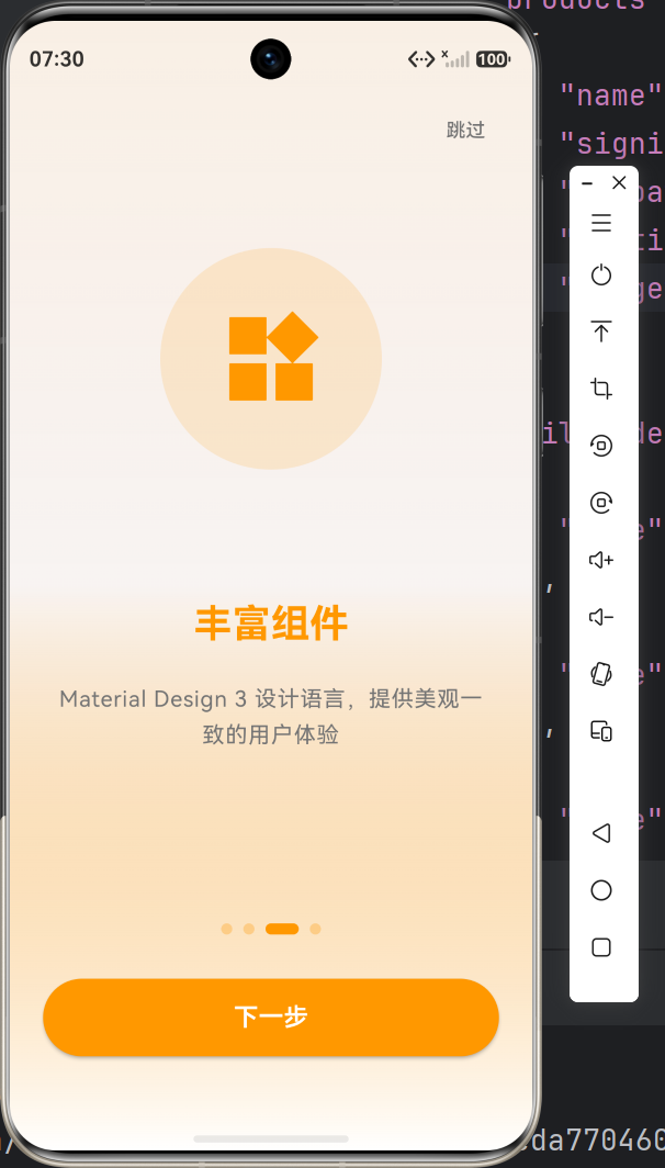 AI Visual Insight: This screenshot shows the first screen of a multi-page onboarding flow on an OpenHarmony device. The page uses a centered card-style layout, with a large icon at the top, a title in the middle, and supporting description text below, forming a clear information hierarchy. It indicates that Flutter components have completed basic rendering adaptation on OpenHarmony and that whitespace control is relatively stable.
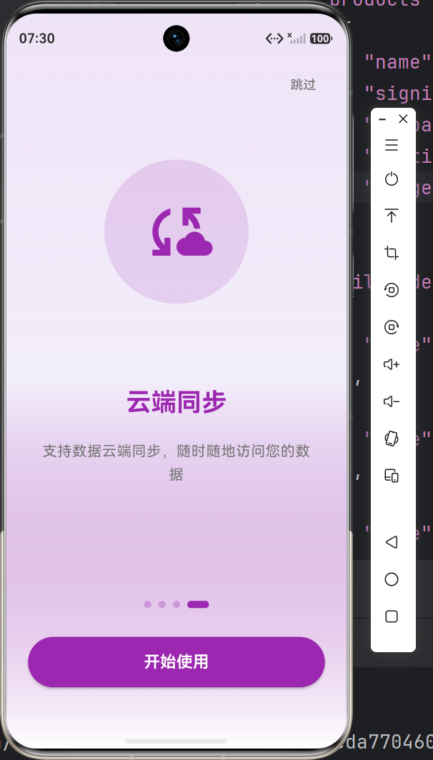 AI Visual Insight: This screenshot shows a later onboarding screen and the bottom action area in practice. The bottom buttons and pagination indicator remain in stable positions, indicating that swipe transitions, state changes, and CTA actions form a complete interaction loop on a real OpenHarmony device.
Real-device validation should cover layout consistency and startup flow reliability
During validation, do not only check whether the page renders. You should also verify whether the full startup flow is stable: whether the onboarding page appears on first install, whether the app goes directly to the home page after completion, and whether subsequent launches skip onboarding.
Test at least four scenarios: devices with different screen sizes, rapid continuous swiping, fast repeated button taps, and first launch after clearing app data. These cases make it easier to uncover layout boundaries and state race conditions.
Common issues can be solved by simplifying structure and initializing state earlier
| Problem Scenario | Solution |
|---|---|
| Layout overflow on some OpenHarmony devices | Use responsive spacing and calculate dimensions dynamically with MediaQuery |
| Choppy swipe transitions | Reduce nested layers and avoid stacking too many complex widgets on each page |
| First-launch state does not persist reliably | Initialize persistent state early during app startup |
| Button taps do not respond | Check hit testing, callback bindings, and route registration |
| Inconsistent display across devices | Standardize the design baseline and avoid hardcoded pixel values |
This table summarizes the five most common onboarding adaptation issues and their corresponding fixes.
This pattern works well as a general template for migrating Flutter applications to OpenHarmony
From an engineering perspective, the value of an onboarding flow goes beyond new-user education. It is also a low-risk entry module for validating whether the foundational capabilities of Flutter for OpenHarmony are stable. At the same time, it covers four critical layers: layout, interaction, state, and routing.
If your goal is to migrate existing Flutter applications at scale, prioritize foundational modules such as onboarding, login, and settings as the first batch of OpenHarmony validation targets. This helps you establish cross-platform adaptation standards more quickly.
FAQ
Why does a Flutter onboarding flow often become choppy after being migrated to OpenHarmony?
Because onboarding screens often include large images, icons, animations, and multi-layer layouts. If the widget hierarchy is too deep or the page content is too heavy, rendering pressure increases significantly on OpenHarmony devices. Simplify the structure first, and use PageView with lightweight state updates.
Why does the onboarding screen sometimes appear repeatedly even though the first-launch state was saved successfully?
The most common reason is that the app does not wait for persistent storage to finish loading during startup, or the route entry decision happens too early. The correct approach is to asynchronously read SharedPreferences during app initialization before deciding whether to enter the onboarding flow or the home page.
How can the onboarding UI remain consistent across different OpenHarmony devices?
The key is to avoid hardcoded fixed dimensions and instead use flexible layouts, unified margins, and relative spacing. When necessary, use MediaQuery to read the screen width and height and dynamically adjust the size of icons, buttons, and text areas.
Core Summary: This article refactors the implementation pattern for Flutter for OpenHarmony onboarding flows. It covers environment setup, multi-page onboarding with PageView, indicator and button interactions, first-launch state persistence, and real-device validation, helping developers quickly complete onboarding adaptation and experience optimization for Flutter applications on OpenHarmony.