This article focuses on implementing a rating component in Flutter for OpenHarmony. It covers three core capabilities: read-only ratings, interactive ratings, and half-star rendering. It addresses common issues in HarmonyOS app development, including missing user feedback entry points, inconsistent rating displays, and fragmented interaction patterns. Keywords: Flutter, OpenHarmony, rating component.
Technical specifications are straightforward
| Parameter | Description |
|---|---|
| Language | Dart |
| Framework | Flutter |
| Target Platform | OpenHarmony / HarmonyOS adaptation scenarios |
| UI Protocol | Material Design style |
| Interaction Methods | Icon, IconButton, GestureDetector, Slider |
| Number of Stars | Not specified in the source |
| Core Dependency | flutter/material.dart |
| Supported Capabilities | Read-only ratings, tap-to-rate, half-star rendering |
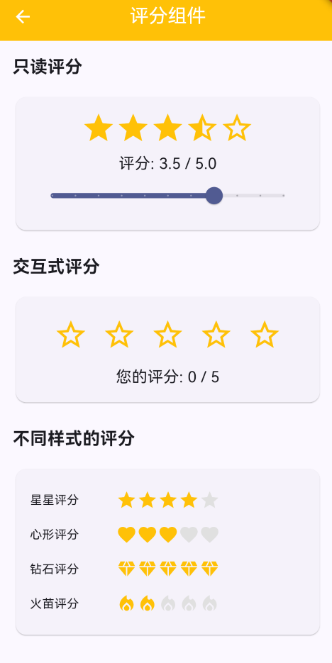 AI Visual Insight: This image shows how the rating component renders inside a content page. The primary visual elements are a sequence of star icons and a score feedback area. It indicates that the component is built around two key capabilities: rating visualization and user tap feedback. This design works well for product reviews, app ratings, and service satisfaction collection.
The component is designed for rating and feedback scenarios in HarmonyOS apps
A rating component is a high-frequency foundational UI element commonly used in e-commerce, content communities, and app stores. In Flutter for OpenHarmony projects, its value goes beyond displaying a score. It also provides a unified way to collect feedback and update state.
Although the original implementation is simple, it already covers three essential capabilities: fixed-value display, half-star logic, and immediate score updates after user input. This makes it a strong candidate for extraction into a reusable page or standalone business component.
The component capability boundary is already sufficient for a first release
The source article lists features such as read-only ratings, interactive ratings, different icon styles, and half-star support. The most important part is the dual-mode design of read-only plus interactive, because these correspond to display mode and input mode.
import 'package:flutter/material.dart';

class RatingComponentPage extends StatefulWidget {
  const RatingComponentPage({super.key});

  @override
  State
<RatingComponentPage> createState() => _RatingComponentPageState();
}

class _RatingComponentPageState extends State
<RatingComponentPage> {
  double _rating = 3.5; // Read-only rating with half-star support
  int _interactiveRating = 0; // Integer rating selected by the user

  @override
  Widget build(BuildContext context) {
    return Scaffold(
      appBar: AppBar(
        title: const Text('评分组件'),
        centerTitle: true,
      ),
      body: const SizedBox(),
    );
  }
}
This code defines the base state for the rating page, where _rating is used for display mode and _interactiveRating is used for interaction mode.
The core implementation depends on icon selection logic and state refresh behavior
The key to read-only ratings is mapping a decimal score to full stars, half stars, and empty stars. The original implementation uses two layers of checks: index < _rating.floor() and index < _rating. The logic is clear and the performance cost is low.
Interactive ratings are even more direct. When the user taps a star, the component writes the state as index + 1. This pattern fits most discrete rating models from 1 to 5.
Read-only ratings use conditional expressions to render half stars
Row(
  mainAxisAlignment: MainAxisAlignment.center,
  children: List.generate(5, (index) {
    return Icon(
      index < _rating.floor()
          ? Icons.star // Full star: index is below the integer portion
          : index < _rating
              ? Icons.star_half // Half star: index falls within the fractional range
              : Icons.star_border, // Empty star: all remaining positions
      color: Colors.amber,
      size: 40,
    );
  }),
)
This code converts a floating-point rating into a stable visual result made up of five star icons.
Interactive ratings directly determine how smooth the user input flow feels
Compared with display mode, interaction mode focuses more on whether tap feedback is immediate. The original article wraps each Icon in an IconButton, which keeps implementation cost low and naturally provides button semantics and tap handling.
If your business flow needs to collect service ratings, product satisfaction scores, or review scores, this structure can connect directly to state management or a network request layer without rewriting the UI.
A minimal tap-to-rate implementation is sufficient for most scenarios
Row(
  mainAxisAlignment: MainAxisAlignment.center,
  children: List.generate(5, (index) {
    return IconButton(
      icon: Icon(
        index < _interactiveRating
            ? Icons.star // Selected star
            : Icons.star_border, // Unselected star
        color: Colors.amber,
        size: 40,
      ),
      onPressed: () {
        setState(() {
          _interactiveRating = index + 1; // Update the score immediately after tap
        });
      },
    );
  }),
)
This code delivers the most basic interactive star rating flow and refreshes the UI immediately through setState.
A two-card page structure makes the example easier to teach and reuse
The original implementation separates read-only ratings and interactive ratings into two card sections. This layout has two advantages: it makes the demo clearer, and it defines cleaner boundaries for future component extraction.
For OpenHarmony adaptation projects, this type of demo page fits well in a component sample library or a Design System Playground, where teams can verify cross-platform consistency.
The reusable page body is shown below
body: SingleChildScrollView(
  padding: const EdgeInsets.all(16),
  child: Column(
    crossAxisAlignment: CrossAxisAlignment.start,
    children: [
      const Text('只读评分'),
      Slider(
        value: _rating,
        min: 0,
        max: 5,
        divisions: 10, // 0.5-point granularity
        onChanged: (value) {
          setState(() {
            _rating = value; // Update the read-only display value when dragging the slider
          });
        },
      ),
      const Text('交互式评分'),
    ],
  ),
)
This code shows that the page does more than display ratings. It can also validate half-star rendering dynamically through a slider.
Three engineering concerns should take priority in HarmonyOS adaptation scenarios
First, the rating range should be constrained to a fixed interval, usually 0 to 5. Second, half-star rendering must align with the score granularity used by the backend. Third, interactive ratings should define whether repeated taps can cancel a selection.
If you later evolve this into a general-purpose component, it is a good idea to expose four parameters: maxRating, allowHalf, readOnly, and onRatingChanged, so you can standardize the API design.
FAQ
Q1: How do you implement half-star ratings in Flutter for OpenHarmony?
A: Use index < rating.floor() to determine full stars, then use index < rating to determine half stars, and render empty stars for the rest. Combined with Slider and divisions: 10, this gives you 0.5-step rating granularity.
Q2: Why use IconButton instead of a plain Icon for interactive ratings?
A: IconButton includes built-in tap semantics and event handling, which makes the code cleaner and more suitable for future accessibility support, analytics instrumentation, and state update logic.
Q3: What real-world scenarios is this rating component suitable for?
A: It works well for product reviews, app ratings, service feedback, and content satisfaction surveys. If you need to submit the score to a backend service, simply add an API call after onPressed or after the state change.
Core summary
This article reconstructs a practical Flutter for OpenHarmony rating component solution. It focuses on read-only ratings, interactive ratings, half-star rendering, and UI organization. It provides Flutter code that can be used directly in production-oriented demos, while also explaining adaptation value, implementation principles, and common issues in HarmonyOS scenarios.