This article breaks down a watch accessories app built for OpenHarmony. It focuses on product lists, detail pages, strap/watch-face switching, and bottom navigation. It also addresses cross-platform UI implementation, ArkTS syntax constraints, and real-device validation on HarmonyOS. Keywords: Flutter for OpenHarmony, ArkTS, ArkUI.
The technical specification snapshot provides the project baseline
| Parameter | Description |
|---|---|
| Target Platform | OpenHarmony / HarmonyOS devices |
| Primary Language | ArkTS |
| UI Framework | ArkUI |
| Development Framework | Flutter for OpenHarmony 3.12+ |
| Routing Protocol | HarmonyOS native routing mechanism |
| State Management | Native ArkTS state management |
| Repository | https://atomgit.com/maaath/watch-app-flutter |
| Stars | Not provided in the source |
| Core Dependencies | Flutter for OpenHarmony, ArkUI component library, router, promptAction |
This architecture serves a product showcase app for wearable-device scenarios
This project is not a simple page assembly. It is a complete business template for watch accessories. The feature set includes product discovery, detail browsing, strap matching, watch face management, favorites history, and a settings page. That makes it well suited for demonstrating the consumer app development workflow on OpenHarmony.
From an architectural perspective, it organizes code through a host project plus ArkTS page components. The directory structure separates the entry point, pages, components, models, utilities, and routing configuration, which makes it easier to extend the app with additional tabs and business modules.
entry/
├── src/main/ets/
│   ├── entryability/EntryAbility.ets
│   ├── pages/MainPage.ets
│   ├── view/components/
│   ├── view/model/WatchModel.ets
│   ├── view/pages/
│   └── utils/Logger.ets
└── src/main/resources/base/profile/main_pages.json
This structure shows a typical layered OpenHarmony frontend project, with clear separation of responsibilities across pages, components, and models.
The data model must stabilize early or page state will quickly become unmanageable
Watch products, straps, and watch faces are the three core entities. The original implementation first standardizes fields through interfaces, then lets the list page, detail page, and preview components share the same data source. This design is critical for synchronizing state across pages.
export interface Watch {
  id: string;
  name: string;
  brand: string;
  price: number;
  originalPrice: number;
  thumbnailUrl: string;
  rating: number;
  salesCount: number;
  isFavorite: boolean;
  straps: WatchStrap[];
}

export interface WatchStrap {
  id: string;
  name: string;
  color: string;
  material: string;
  price: number;
}

export interface WatchFace {
  id: string;
  name: string;
  style: string;
  isInstalled: boolean;
}
This code establishes consistent type boundaries and prevents implicit typing issues in complex ArkTS component communication.
The product card component carries most of the list-page experience quality
A watch card must handle image presentation, price display, rating visualization, and click navigation at the same time. The original implementation uses a Stack + Column + Row combination to build the card layout and overlays the favorite button in the top-right corner of the image.
@Component
export struct WatchCard {
  @Prop watch: Watch;

  build() {
    Column() {
      Image(this.watch.thumbnailUrl) // Product thumbnail
        .width('100%')
        .height(160);

      Text(this.watch.name) // Product name
        .fontSize(14);

      Text('¥' + this.watch.price) // Current price
        .fontColor('#FF4081');
    }
    .onClick(() => {
      router.pushUrl({ // Navigate to the detail page after click
        url: 'view/pages/WatchDetailPage',
        params: { watchId: this.watch.id }
      });
    })
  }
}
This code demonstrates the minimum closed loop for a product list: render data, respond to clicks, and pass parameters into the detail page.
The dynamic watch face preview is the most distinctive interaction in this project
The watch face page goes beyond static thumbnails and uses state-driven rendering to simulate a real clock. The component updates the time once per second through setInterval, then converts hours, minutes, and seconds into rotation angles to produce a dynamic preview.
@Component
export struct WatchFacePreview {
  @State currentTime: Date = new Date();
  @State secondAngle: number = 0;

  aboutToAppear(): void {
    this.updateTime();
    setInterval(() => {
      this.updateTime(); // Refresh the clock state once per second
    }, 1000);
  }

  private updateTime(): void {
    this.currentTime = new Date();
    this.secondAngle = (this.currentTime.getSeconds() / 60) * 360; // Calculate the second hand angle
  }
}
This code upgrades a purely presentational page into a dynamic UI that reflects the passage of time, which makes the wearable experience feel more realistic.
The detail page connects product presentation with configuration capabilities
The detail page does more than display price, images, and specifications. It also handles strap and watch-face switching. The original implementation uses selectedStrap, selectedFace, and transition state variables to control the interaction flow, then simulates an asynchronous switching effect through a delay.
@State selectedStrap: WatchStrap | null = null;
@State strapTransitioning: boolean = false;

selectStrap(strap: WatchStrap): void {
  this.strapTransitioning = true;
  setTimeout(() => {
    this.selectedStrap = strap; // Update the currently selected strap
    this.strapTransitioning = false;
    promptAction.showToast({ message: `Selected "${strap.name}"` }); // Provide immediate feedback
  }, 300);
}
This code reflects a core principle of HarmonyOS page interaction: state changes, visual transitions, and feedback prompts must be designed together.
Bottom tab navigation defines the backbone of the app information architecture
The main page uses Tabs to host three primary entry points: Discover, Watch Faces, and Mine. For consumer apps, this structure is clear and well suited to small-screen devices, especially watches and lightweight terminals where users switch frequently between core sections.
@Entry
@Component
struct MainPage {
  @State currentIndex: number = 0;

  build() {
    Tabs({ barPosition: BarPosition.End }) {
      TabContent() { WatchDiscoverPage() }
      TabContent() { WatchFacePage() }
      TabContent() { WatchMinePage() }
    }
    .onChange((index: number) => {
      this.currentIndex = index; // Record the currently selected tab
    });
  }
}
This code builds the app-level navigation skeleton and lays the foundation for extending settings, messaging, or store pages later.
ArkTS and ArkUI constraints determine whether the project compiles reliably
The original case specifically emphasizes that ArkTS is not a drop-in equivalent of standard TypeScript. The most common issues involve generic inference, anonymous object literals, and component property compatibility. These differences directly affect whether the project compiles successfully.
async getWatchList(page: number): Promise<Watch[]> {
  const delay = (ms: number): Promise
<void> => {
    return new Promise
<void>(resolve => setTimeout(resolve, ms));
  };
  await delay(500); // Explicitly declare the Promise return type
  return this.createMockWatches(page);
}
This code shows that in ArkTS, you should explicitly annotate return types whenever possible instead of relying on inference.
Real-device screenshot validation shows this project has moved beyond the demo stage
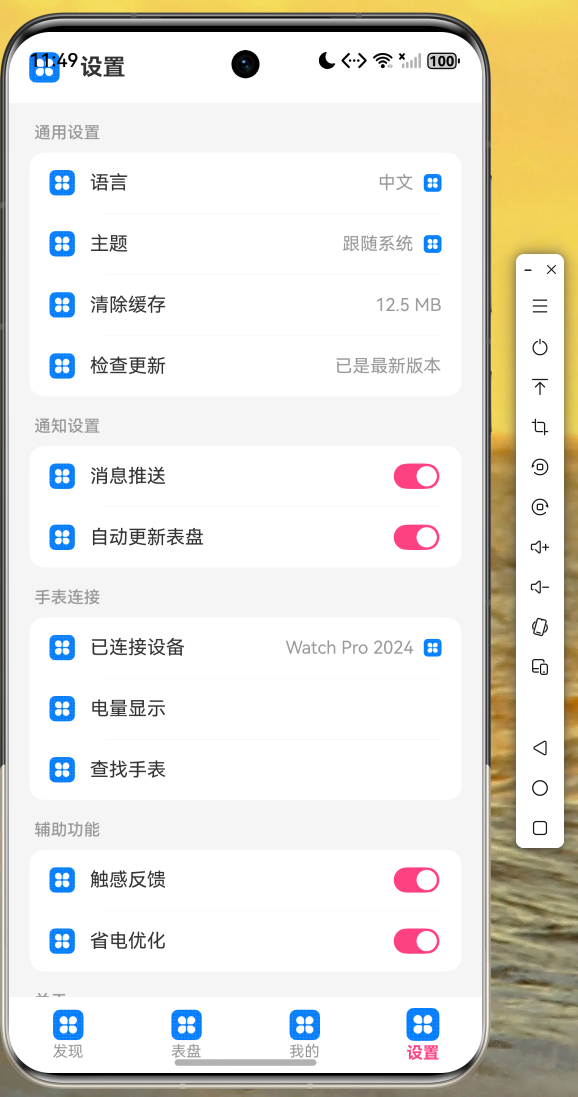 AI Visual Insight: This screenshot shows the real runtime state of the settings page on a HarmonyOS device. The interface uses a vertical information-flow layout, preserves a standard page title area at the top, and places grouped settings items and feature entries in the middle. This confirms that list rendering, spacing control, and basic interactions all work correctly on real hardware.
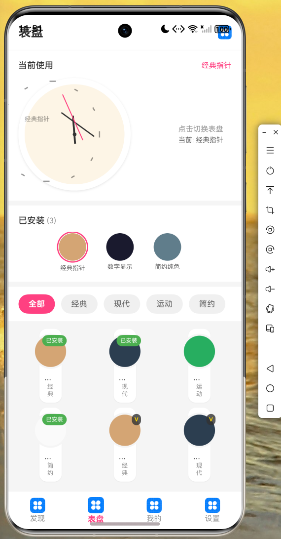 AI Visual Insight: This image highlights the dynamic preview area and the candidate watch-face list. The main preview area at the top simulates a realistic circular watch face, while the grid or list below supports switching between styles. This indicates that state-driven rendering, selection feedback, and multi-component coordination are all functioning correctly.
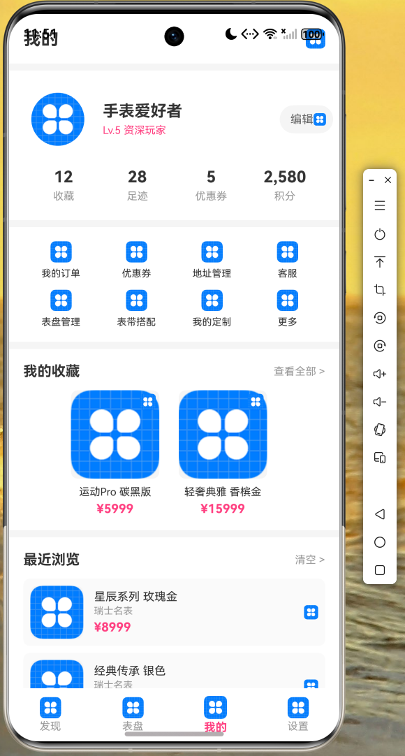 AI Visual Insight: The image shows a personal-center page with a user info card, statistics items, and a functional menu. The page structure matches the standard design of the “Mine” section in e-commerce apps, which indicates that favorites, browsing history, entry aggregation, and detail-page navigation have already been integrated at a foundational level.
The real value of this case lies in a reusable HarmonyOS cross-platform methodology
First, it proves that Flutter for OpenHarmony can support a complete consumer application prototype rather than only a single-page showcase. Second, it provides a reproducible path for ArkTS modeling, ArkUI component orchestration, and real-device validation. Third, it exposes the syntax boundaries of ArkTS so teams can avoid compilation risks in advance.
If you are preparing to launch a cross-platform storefront, wearable accessories app, or digital watch face project on OpenHarmony, you can use this case directly as a minimum runnable template for secondary development.
FAQ: The 3 questions developers care about most
1. What is the relationship between Flutter for OpenHarmony and ArkTS?
Flutter for OpenHarmony adapts cross-platform capabilities, while the host side and part of the page-layer functionality still need to be implemented with ArkTS and ArkUI. You need to understand the boundary between the two to design pages, routing, and system capability calls correctly.
2. Why does the example repeatedly use explicit type declarations?
Because ArkTS has weaker type inference than standard TypeScript, especially in Promise, generic, and object-literal scenarios. Explicit typing can significantly reduce the chance of compilation failure.
3. What kinds of business scenarios is this project best suited to extend?
It is best suited for product showcase apps, configurable accessories, digital watch faces, lightweight e-commerce, and companion device applications. It already includes a general-purpose skeleton with lists, detail pages, configuration switching, a personal center, and bottom navigation.
Core summary
This article reconstructs a Flutter for OpenHarmony watch accessories app case and focuses on ArkTS data models, product cards, dynamic watch face previews, detail-page interactions, and bottom navigation. It also summarizes the key ArkUI and ArkTS constraints related to type declarations, component properties, and real-device runtime validation.