This article focuses on implementing Material Design 3 in Flutter chat applications, addressing common pain points such as inconsistent cross-platform UI, fragmented theming, and fragile OpenHarmony adaptations. Core topics include global
ThemeDataconfiguration, page-level component standardization, and OpenHarmony compatibility practices. Keywords: Flutter, Material Design 3, OpenHarmony.
Technical Specification Snapshot
| Parameter | Description |
|---|---|
| Programming Language | Dart |
| UI Framework | Flutter |
| Design System | Material Design 3 |
| Target Platforms | Android / iOS / OpenHarmony |
| Routing Solution | go_router |
| State Management | provider |
| Core Standards | Material component specifications, platform rendering adaptation |
| GitHub Stars | Not provided in the source |
| Core Dependencies | flutter, provider, go_router |
This approach upgrades chat app UI from page-level assembly to theme-level governance
Chat applications demand a high degree of consistency. If the login page, conversation list, bottom navigation, input fields, and buttons are styled independently, issues such as color drift, inconsistent corner radii, and insufficient touch targets quickly appear across Android, iOS, and OpenHarmony.
The value of Material Design 3 goes beyond a more modern visual style. More importantly, it provides a reusable system of design tokens. In Flutter, useMaterial3: true is only the entry point. The real key to a stable implementation is centralized ThemeData encapsulation.
Global themes are the single most valuable entry point for MD3 in Flutter projects
You should extract the theme into a dedicated file such as themes/app_theme.dart and configure colors, corner radii, input fields, buttons, and navigation bars in one place. This avoids handwritten local styles on individual pages and reduces long-term maintenance costs.
import 'package:flutter/material.dart';

class AppTheme {
  // Define primary and supporting colors centrally to avoid hardcoding in pages
  static const primary = Color(0xFF4A6FFF);
  static const secondary = Color(0xFF5AC8FA);
  static const tertiary = Color(0xFF34D399);

  static ThemeData get lightTheme {
    return ThemeData(
      useMaterial3: true, // Enable core MD3 capabilities
      colorScheme: const ColorScheme.light(
        primary: primary,
        secondary: secondary,
        tertiary: tertiary,
        surface: Colors.white,
        background: Color(0xFFF7F9FC),
        onSurface: Color(0xFF1C1C1E),
      ),
      cardTheme: const CardTheme(
        elevation: 1, // Keep shadows subtle
        shape: RoundedRectangleBorder(
          borderRadius: BorderRadius.all(Radius.circular(16)), // Standardize card corner radius
        ),
      ),
      inputDecorationTheme: const InputDecorationTheme(
        filled: true,
        border: OutlineInputBorder(
          borderRadius: BorderRadius.all(Radius.circular(12)), // Standardize input field corner radius
          borderSide: BorderSide.none,
        ),
      ),
    );
  }
}
This code establishes a global MD3 design baseline so that all subsequent pages inherit a consistent visual style by default.
Theme injection must happen at the application root, not inside individual pages
If you define themes only on local pages, navigation bars, dialogs, and input fields will not share a consistent style. The correct approach is to inject the theme at the MaterialApp.router level and initialize it alongside Provider and the routing system.
import 'package:flutter/material.dart';
import 'themes/app_theme.dart';

class MyApp extends StatelessWidget {
  const MyApp({super.key});

  @override
  Widget build(BuildContext context) {
    return MaterialApp.router(
      title: 'Flutter OpenHarmony Chat App',
      theme: AppTheme.lightTheme, // Inject the global theme
      debugShowCheckedModeBanner: false,
    );
  }
}
This code ensures that the entire app enters a unified MD3 rendering system as soon as it starts.
The login page and navigation page are the two best areas to standardize first
The login page is the user’s first point of contact with the interface, making it the best place to showcase MD3 corner radii, spacing, and hierarchy. The bottom navigation determines the experience of switching between core flows. If you still use the legacy BottomNavigationBar, it often breaks visual consistency across the app.
The login page should prioritize theme colors, standard input fields, and full-width buttons
A login page does not need heavy decoration. The priority is to express order through background color, spacing, and button states. Always pull colors from Theme.of(context).colorScheme instead of hardcoding grayscale values.
Scaffold(
  backgroundColor: Theme.of(context).colorScheme.background,
  body: Padding(
    padding: const EdgeInsets.all(24), // Follow the 24px page padding standard
    child: Column(
      children: [
        const SizedBox(height: 80),
        const Text('Welcome Back'),
        const SizedBox(height: 24),
        const TextField(
          decoration: InputDecoration(labelText: 'Account'), // Reuse the global input style
        ),
        const SizedBox(height: 16),
        const TextField(
          obscureText: true,
          decoration: InputDecoration(labelText: 'Password'),
        ),
      ],
    ),
  ),
)
This code creates a login interaction skeleton that aligns with MD3 using the fewest possible components.
The chat home page should use NavigationBar instead of legacy components
The four main tabs map to Chats, Contacts, Moments, and Me. Under MD3, NavigationBar with NavigationDestination is the recommended approach because it better matches the new standard in animation, label layout, and selected states.
NavigationBar(
  selectedIndex: _selectedIndex,
  onDestinationSelected: (index) {
    setState(() {
      _selectedIndex = index; // Switch the current page index
    });
  },
  destinations: const [
    NavigationDestination(icon: Icon(Icons.chat_bubble_outline), label: 'Chats'),
    NavigationDestination(icon: Icon(Icons.contacts_outlined), label: 'Contacts'),
    NavigationDestination(icon: Icon(Icons.feed_outlined), label: 'Moments'),
    NavigationDestination(icon: Icon(Icons.person_outline), label: 'Me'),
  ],
)
This code builds a cross-platform bottom navigation structure using the MD3 standard.
Chat list styling should center on cards, spacing, and information hierarchy
A conversation list is not just a stack of ListTile widgets. It is the primary information entry point of a chat application. A recommended structure includes lightweight shadowed cards, avatars, titles, subtitles, and unread badges so users can scan information with minimal effort.
Card(
  margin: const EdgeInsets.symmetric(horizontal: 16, vertical: 4),
  child: ListTile(
    leading: const CircleAvatar(
      radius: 22,
      child: Icon(Icons.person),
    ),
    title: Text(session.contactName),
    subtitle: Text(
      session.lastMessage,
      maxLines: 1, // Prevent message text from expanding the layout height
      overflow: TextOverflow.ellipsis,
    ),
    trailing: session.unreadCount > 0
        ? Badge(label: Text('${session.unreadCount}')) // Display unread count
        : null,
  ),
)
This code organizes the conversation list into card-based information units with the hierarchy expected in MD3.
Standards are not visual suggestions but engineering constraints for cross-platform consistency
In this project, a practical recommendation is to keep buttons and input fields at a corner radius of 12, cards and list items at 16, and dialogs at 24. Use 16 or 24 for page padding, and scale vertical spacing in steps of 8, 16, and 24.
You should keep shadows within the elevation: 0~3 range. Heavy shadows look bulky on OpenHarmony devices and high-density screens, and they weaken the lightweight feel of MD3. Text colors should always come from semantic roles such as onSurface and onPrimary.
The key to OpenHarmony adaptation is not rewriting pages but preventing theme failures
Flutter for OpenHarmony has solid compatibility with core MD3 capabilities, but in practice, the most common problems still come from style overrides. Typical mistakes include mixing MD2 components, hardcoding colors directly, relying on platform-default button styles, and forgetting to explicitly define shape for special components.
If rounded corners disappear on some OpenHarmony devices, first verify whether the component actually inherits the theme. If necessary, explicitly assign RoundedRectangleBorder. If text contrast becomes insufficient in light or dark modes, immediately return to semantic colors from colorScheme instead of layering more local patches.
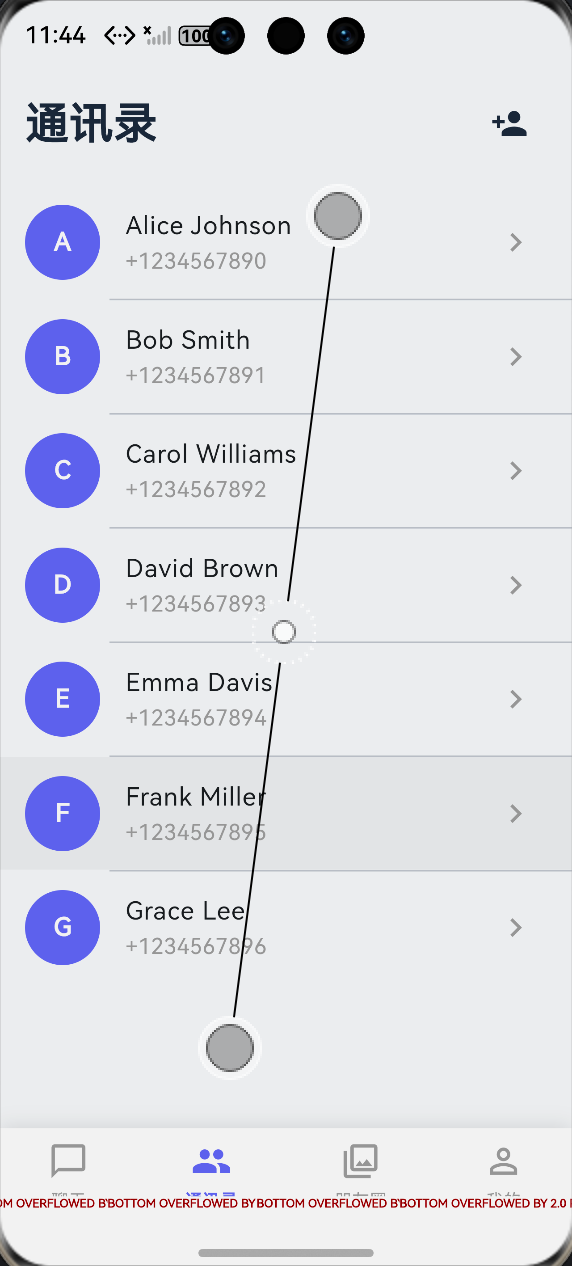 AI Visual Insight: This image shows the overall visual style of the chat application, highlighting MD3’s large rounded containers, soft background hierarchy, card-based information layout, and consistent spacing. For cross-platform QA, focus on whether avatar sizes, list spacing, button touch targets, and bottom navigation selected states remain consistent.
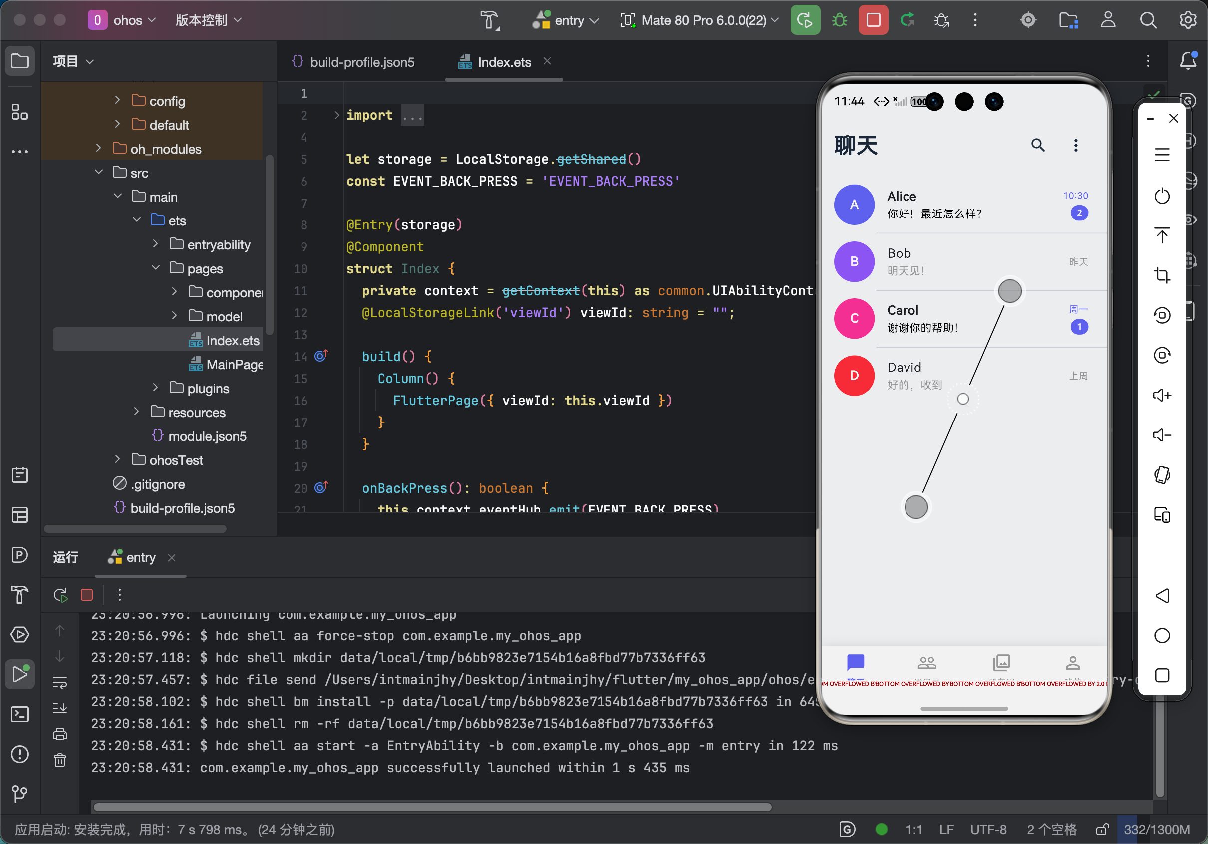 AI Visual Insight: This image is more suitable for inspecting component-level details, including input fill styles, card shadow intensity, typography hierarchy, and page grid structure. For OpenHarmony adaptation, use it to verify whether corner clipping works correctly, whether text overflows, and whether contrast on light backgrounds still meets readability requirements.
FAQ
Q: Why does the UI look more chaotic after enabling useMaterial3: true in a Flutter project?
A: In most cases, the project is still mixing MD2 components or relying heavily on hardcoded colors and corner radii inside pages. The fix is to consolidate colors, cards, buttons, and input fields into ThemeData so pages consume the theme rather than define their own visual rules.
Q: Why must the chat home page switch to NavigationBar instead of BottomNavigationBar?
A: NavigationBar is the standard MD3 component. It provides better selected states, label styling, and animation feedback. If you continue using the legacy component, the app will feel disconnected from the rest of the theme system, especially in multi-platform environments.
Q: What should you check first when rounded corners fail or button styles look inconsistent on OpenHarmony?
A: First, verify that the theme is injected at the root node. Then confirm that the component correctly inherits global styles. If the issue remains, explicitly set shape, padding, and semantic colors instead of relying on platform-default implementations.
Core summary
This article systematically rebuilds the Material Design 3 implementation strategy for a Flutter chat application across OpenHarmony, Android, and iOS. It covers theme injection, color systems, corner radius and spacing standards, NavigationBar, login page and chat list implementation, and common styling issues with practical fixes.