This article focuses on styling native HTML forms with CSS and introduces the box model through hands-on practice. It addresses common pain points such as rough default form styles, difficult layout control, and confusion between padding and margin. Key topics include form structure, unified control styling, and card-based layouts. Keywords: HTML forms, CSS styling, box model.
Technical Specifications Snapshot
| Parameter | Description |
|---|---|
| Topic | Practical HTML Form Styling with CSS |
| Language | HTML, CSS |
| License | Original article marked as CC 4.0 BY-SA |
| Star Count | Not provided |
| Core Dependencies | Native browser form controls, fieldset, input, select, textarea |
| Intended Audience | Front-end beginners, MDN learners |
This hands-on article focuses on transforming native forms from usable to readable
The original goal is straightforward: preserve the semantic structure and submission behavior of the form first, then use a small amount of CSS to upgrade its visual presentation. This is not about building complex components. It is a foundational front-end exercise.
There are two real learning goals here. First, make a native form look like something ready for production. Second, use that process to fully understand the boundaries and responsibilities of margin, padding, and border in the box model.
A native form skeleton should preserve complete semantics first
<form method="get" action="">

<fieldset>

<legend>Personal Information</legend>
    <label for="name">Nickname</label>
    <input type="text" id="name" name="name" placeholder="Enter your nickname" required>

    <label for="city">City</label>
    <select id="city" name="city">
      <option value="">Select a city</option>
      <option value="hengyang">Hengyang</option>
      <option value="haikou">Haikou</option>
      <option value="sanya">Sanya</option>
    </select>

    <label for="intro">About You</label>
    <textarea id="intro" name="intro" rows="4" placeholder="Introduce yourself"></textarea>
  </fieldset>
</form>
This code builds a semantic form skeleton and ensures that later style enhancements do not break native interactions.
Form visual optimization should begin with unified global base styles
Start with page-level styling instead of editing a single input first. This helps avoid visual inconsistency caused by browser default spacing, fonts, and backgrounds. It also matches the way styles are organized in real projects.
body {
  background-color: #f5f5f5; /* Set a light gray background to reduce the harshness of a pure white page */
  font-size: 15px; /* Use a consistent base font size for comfortable reading */
  font-family: "PingFang SC", sans-serif; /* Define a generic Chinese font stack */
}
This style block establishes a consistent visual baseline for the page and creates a stable environment for component-level styling.
The outer form card style is the best entry point for understanding the box model
The form container is often the most intuitive object for demonstrating the box model. Once you combine width, margin, padding, border radius, and shadow, a native form immediately shifts from a browser-default state to a card-layout state.
form {
  width: 500px; /* Limit the form width to prevent excessive stretching on large screens */
  margin: 30px auto; /* Add 30px vertical spacing and center horizontally with auto margins */
  background-color: #fff; /* Use a white background for the card body */
  padding: 20px; /* Leave breathing room for internal controls */
  border-radius: 8px; /* Soften the visual impact of sharp corners */
  box-shadow: 0 0 8px #ccc; /* Add a light shadow to improve depth */
}
This code elevates the form from a bare structure into a centered card while clearly showing the difference between margin and padding.
The three core box model properties should be understood by responsibility, not memorized mechanically
margin controls the outer distance around the box and does not change the content area itself. padding controls internal spacing and, in the standard box model, increases the total occupied size of the element. border is the physical boundary between the content and the outer space.
If beginners often wonder why an element became larger, the reason is usually that they treated padding as visual inner spacing only and overlooked the fact that it also contributes to the final rendered size.
Semantic group styling improves form readability and information hierarchy
fieldset and legend are not just decorative tags. In complex forms, they create local context. When combined with borders, rounded corners, and stronger titles, the grouping becomes much clearer.
fieldset {
  border: 1px solid #999; /* Create a visible boundary for each information group */
  margin-bottom: 20px; /* Add vertical spacing between groups */
  padding: 15px; /* Prevent controls from touching the border */
  border-radius: 6px; /* Make the group visually softer */
}

legend {
  font-weight: bold; /* Increase the visibility of the group title */
  color: #333; /* Improve title contrast */
}
This style block strengthens form sections so areas like personal information and preferences have clear boundaries.
The image comparison clearly shows the difference between default and styled forms
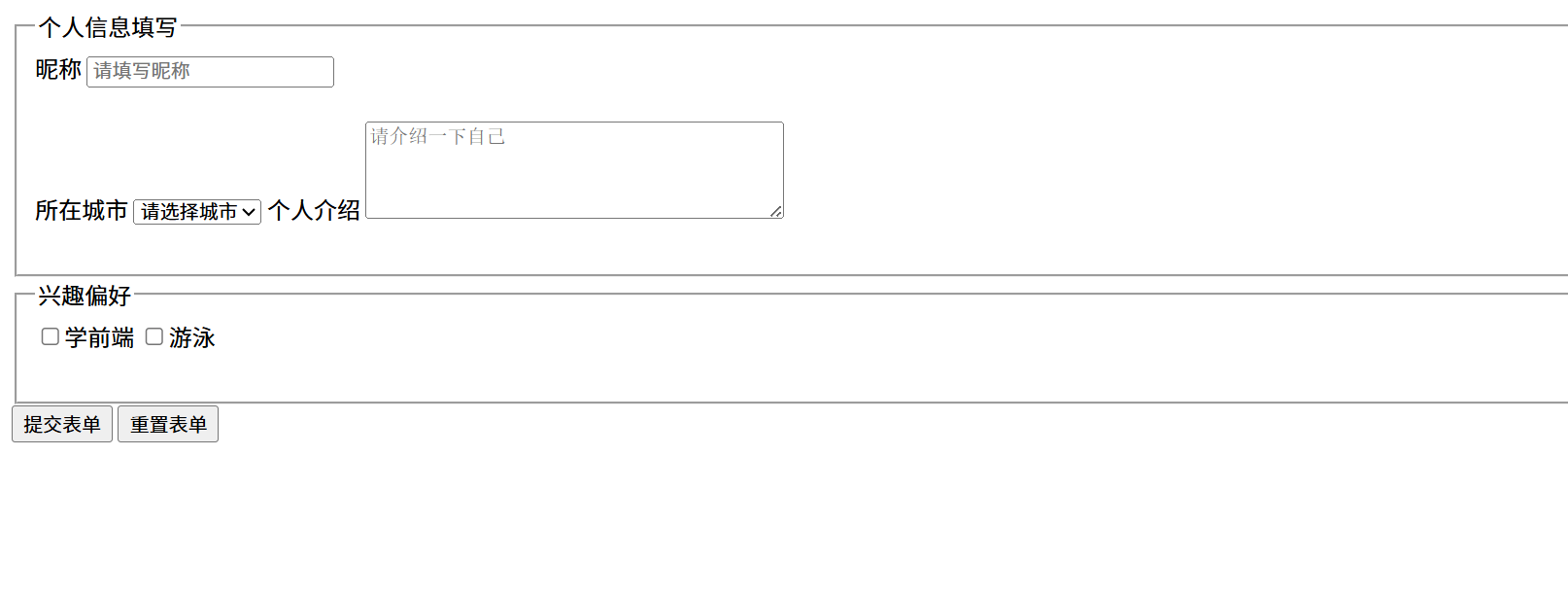 AI Visual Insight: This image shows the browser’s default form styling: loose control alignment, weak visual hierarchy, inconsistent spacing, and little rhythm between the
 fieldset and the input controls. It is a typical example of an unstyled native page.
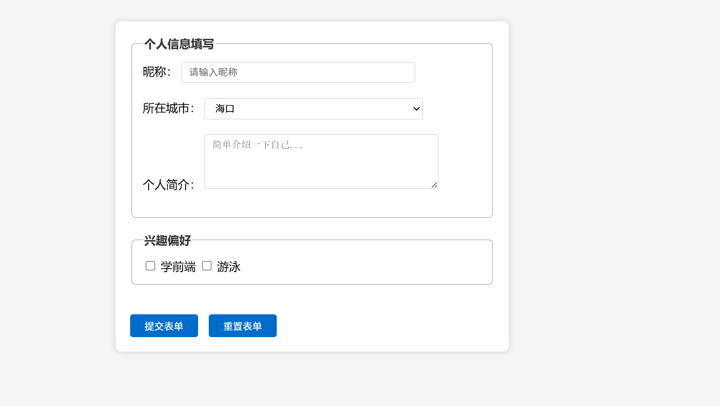 AI Visual Insight: This image shows the final card-based form layout: the form container is centered, the white card contrasts with the gray background, input widths are consistent, and the group borders and button colors follow the same palette. This indicates that the style system already has a basic design standard.
Grouped control selectors are the key technique for consistent form styling
In real projects, you would not style input, select, and textarea one by one. A more efficient approach is to use grouped selectors to unify control dimensions, borders, and focus states.
input[type="text"],
select,
textarea {
  width: 300px; /* Use a consistent width for common form controls */
  padding: 6px 10px; /* Improve top, right, bottom, and left spacing for input content */
  border: 1px solid #ccc; /* Use a subtle light gray border for a restrained look */
  border-radius: 4px; /* Make control edges softer */
  outline: none; /* Remove the browser's default focus outline */
}

input:focus,
select:focus,
textarea:focus {
  border-color: #0066cc; /* Highlight the border on focus to indicate the active input */
}
This style block unifies the size and interaction feedback of major form controls and significantly improves consistency.
Button styling should belong to the same visual system as input controls
Buttons are not isolated elements. Their color, border radius, spacing, and hover feedback should continue the design language established by the inputs and the container. Otherwise, the page will feel visually assembled rather than designed.
input[type="submit"],
input[type="reset"] {
  padding: 6px 20px; /* Enlarge the clickable area to improve usability */
  border: none; /* Remove the default border */
  background-color: #0066cc; /* Set the primary action button color */
  color: #fff; /* Ensure strong text contrast on the button */
  border-radius: 4px; /* Match the corner radius of the input controls */
  cursor: pointer; /* Show a clickable pointer on hover */
  margin-right: 10px; /* Leave spacing between buttons */
}
This code creates a unified and clear interaction style for submit and reset buttons.
The fully integrated code works well as a reusable template for front-end beginners
Once you combine the HTML structure, container styling, group styling, and control styling, you get a basic form template that runs directly. It works well for classroom exercises, beginner assignments, and static page prototypes.
<!DOCTYPE html>
<html lang="zh-CN">
<head>
  <meta charset="UTF-8">

<title>Practical CSS Form Styling</title>

<style>
    body { background:#f5f5f5; font-size:15px; font-family:"PingFang SC", sans-serif; }
    form { width:500px; margin:30px auto; background:#fff; padding:20px; border-radius:8px; box-shadow:0 0 8px #ccc; }
    fieldset { border:1px solid #999; margin-bottom:20px; padding:15px; border-radius:6px; }
    legend { font-weight:bold; color:#333; }
    input[type="text"], select, textarea { width:300px; padding:6px 10px; border:1px solid #ccc; border-radius:4px; outline:none; }
    input:focus, select:focus, textarea:focus { border-color:#0066cc; }
    input[type="submit"], input[type="reset"] { padding:6px 20px; border:none; background:#0066cc; color:#fff; border-radius:4px; cursor:pointer; margin-right:10px; }
  </style>
</head>
<body>
  <!-- Preserve native form submission behavior for learning form fundamentals -->
  <form method="get" action="">

<fieldset>

<legend>Personal Information</legend>
      <label for="name">Nickname</label>
      <input type="text" id="name" name="name" placeholder="Enter your nickname" required>
    </fieldset>
  </form>
</body>
</html>
This integrated example is a minimal runnable template that you can continue extending with validation, responsive behavior, and interaction logic.
FAQ
Why does padding make the box larger while margin does not?
Because in the standard box model, the final occupied size of an element is composed of content + padding + border. margin only affects the distance between the element and the outside world. It does not participate in calculating the size of the content area.
Why is it recommended to keep fieldset and legend when styling forms?
They do more than provide visual grouping. They preserve semantic structure, which helps accessibility, maintenance, and future extension. For beginners, this is a better habit than wrapping everything in plain div elements.
Why should you unify the width and focus states of input, select, and textarea?
Consistent dimensions improve visual order, and consistent focus states clearly indicate the current input position. Both directly affect readability and usability, making them simple but high-value improvements.
Core Summary
Based on an MDN-style form exercise, this article reconstructs a directly runnable HTML and CSS solution that systematically explains the native form styling workflow, semantic grouping with fieldset, unified input control styling, and the real layout behavior of the three core box model properties: margin, padding, and border.