Technical Specifications at a Glance
| Parameter | Description |
|---|---|
| Tech Stack | Flutter, Dart |
| Target Platforms | OpenHarmony / HarmonyOS-compatible environments |
| UI Adaptation Strategy | flutter_screenutil + MediaQuery |
| Routing Method | MaterialApp named routes |
| Core Page | HomePage |
| Core Dependencies | flutter_screenutil, material |
| Article Scope | Day 2 hands-on: UI, components, adaptation, routing |
| Original Popularity Metrics | About 311 views, 3 likes, 5 saves |
This article focuses on three things: home page UI, component abstraction, and OpenHarmony adaptation
This article walks through the core Day 2 implementation for Smart Community: building the home page UI with Flutter, extracting reusable global components, and adapting the app for OpenHarmony phones, tablets, and the DAYU200 development board. The main problems addressed are inconsistent cross-device layouts, weak touch interaction, and high component reuse costs. Keywords: Flutter, OpenHarmony, multi-device adaptation.
This day of development did not introduce complex business logic. Instead, it prioritized stabilizing the interface skeleton first. In a smart community project, the home page determines information hierarchy, entry-point efficiency, and age-friendly usability. Because of that, solidifying layout, components, and routing before integrating APIs delivers better engineering value.
From an implementation perspective, the Day 2 goals were clear: first complete the four main home page entry points, then extract buttons, input fields, and notice cards into global reusable components, and finally finish OpenHarmony multi-device adaptation and base routing. That way, when Day 3 introduces dynamic data, the page structure does not need to be rewritten.
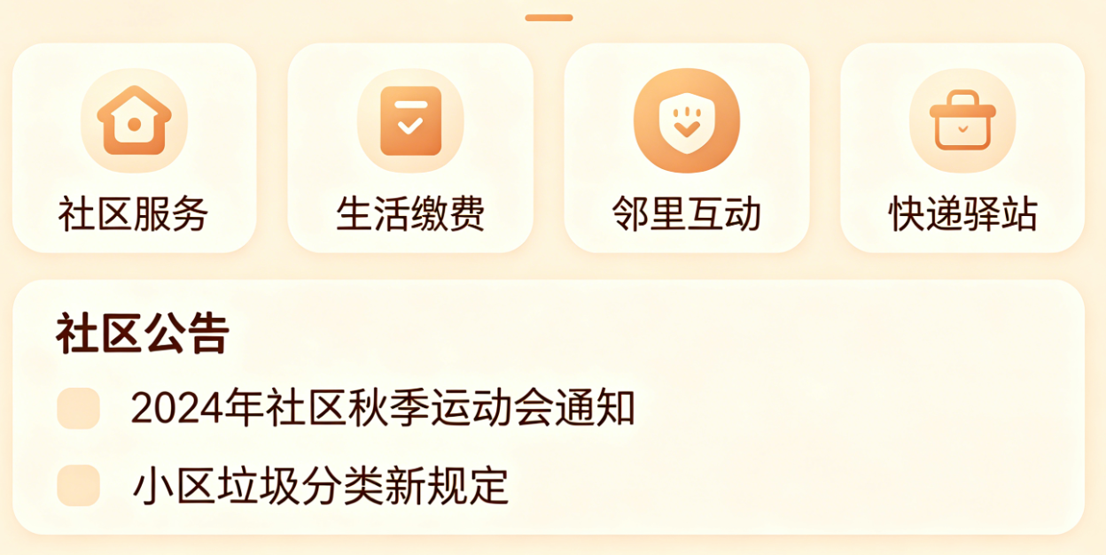 AI Visual Insight: The image shows the visual prototype of the smart community home page. The main regions include a top title area, a grid of feature entry points, and lower information modules. This indicates a strongly partitioned layout that emphasizes readability, low learning cost, and large touch targets, making it suitable for a shared design language across phones and tablets.
The home page structure combines a vertical flow with grid-based entry points
The recommended home page structure uses Scaffold + SingleChildScrollView + GridView.count. The reason is straightforward: the top navigation naturally fits AppBar, the four core entry points work well in a grid, and notices or prompts are better carried by continued vertical scrolling.
import 'package:flutter/material.dart';
import 'package:flutter_screenutil/flutter_screenutil.dart';

class HomePage extends StatelessWidget {
  const HomePage({super.key});

  @override
  Widget build(BuildContext context) {
    final isLargeScreen = MediaQuery.of(context).size.width >= 600; // Detect whether the device has a large screen
    return Scaffold(
      appBar: AppBar(
        title: Text(
          '智联邻里社区',
          style: TextStyle(fontSize: isLargeScreen ? 18.sp : 16.sp), // Dynamically adjust font size based on screen size
        ),
        centerTitle: true,
      ),
      body: SingleChildScrollView(
        child: Column(
          children: [
            GridView.count(
              shrinkWrap: true,
              crossAxisCount: isLargeScreen ? 3 : 2, // Three columns on large screens, two on small screens
              physics: const NeverScrollableScrollPhysics(),
              padding: EdgeInsets.all(16.w),
              childAspectRatio: 1.2,
              children: const [],
            ),
          ],
        ),
      ),
    );
  }
}
This code establishes the responsive layout skeleton for the home page and reserves a stable container for subsequent component assembly.
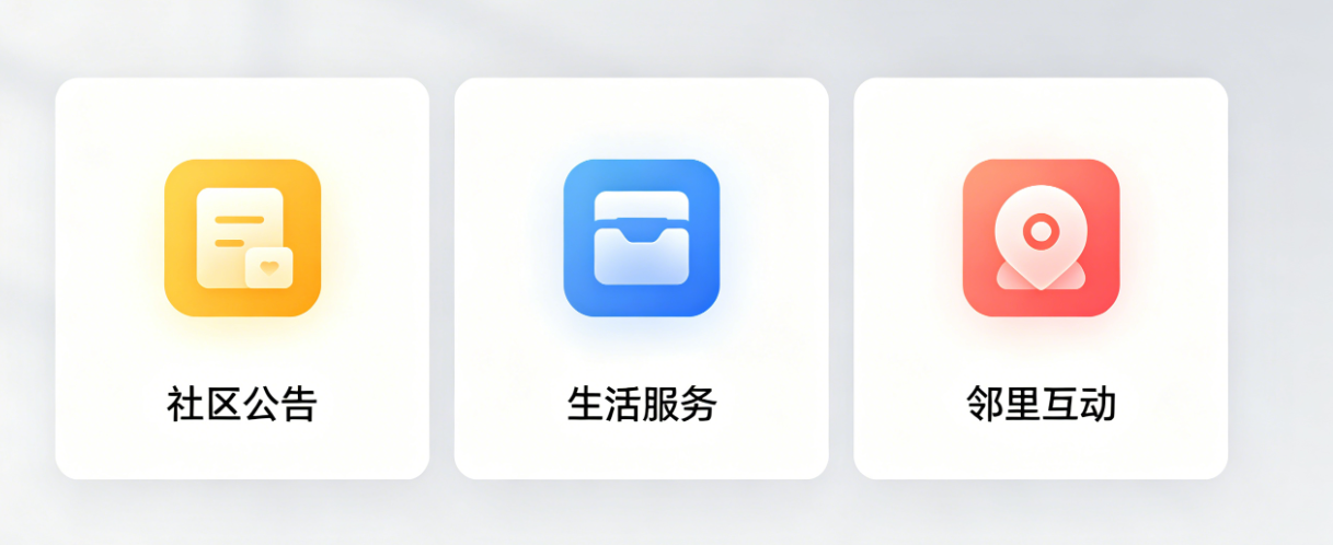
Extracting global components significantly reduces the cost of future page development
When the project continues expanding into government services, neighborhood interaction, property repair, and more, buttons, input fields, and cards must be abstracted consistently. Otherwise, style drift and maintenance costs rise quickly. The three Day 2 components effectively build the smallest viable loop of a UI design system.
Age-friendly buttons should prioritize larger touch targets and stronger text weight
A button is not just about changing color. It must solve two practical issues: older users may struggle with precise tapping, and development boards often provide weaker touch accuracy. The core strategy is to increase height, use bold text, standardize corner radius, and unify the primary color.
class CustomButton extends StatelessWidget {
  final String text;
  final VoidCallback onTap;

  const CustomButton({super.key, required this.text, required this.onTap});

  @override
  Widget build(BuildContext context) {
    return GestureDetector(
      onTap: onTap,
      child: Container(
        height: 56.h, // Increase button height to improve touch usability
        alignment: Alignment.center,
        decoration: BoxDecoration(
          color: const Color(0xFF2E8B57), // Use a unified project primary color
          borderRadius: BorderRadius.circular(8.r),
        ),
        child: Text(
          text,
          style: TextStyle(fontSize: 16.sp, fontWeight: FontWeight.bold), // Improve readability
        ),
      ),
    );
  }
}
This code encapsulates a unified interactive button and specifically optimizes age-friendly tap behavior and brand-level visual consistency.
Input fields and notice cards support future form and information-feed scenarios
The input field component reserves space for login, search, and repair forms. The notice card serves as the home page information unit. What they share is a consistent size system, clear text presentation, and direct reusability.
class NoticeCard extends StatelessWidget {
  final String title;
  final String content;

  const NoticeCard({super.key, required this.title, required this.content});

  @override
  Widget build(BuildContext context) {
    return Container(
      width: 280.w, // Control card width to support horizontal scrolling
      padding: EdgeInsets.all(16.w),
      margin: EdgeInsets.only(right: 12.w),
      decoration: BoxDecoration(
        border: Border.all(color: Colors.grey.shade200),
        borderRadius: BorderRadius.circular(8.r),
      ),
      child: Column(
        crossAxisAlignment: CrossAxisAlignment.start,
        children: [
          Text(title, style: TextStyle(fontSize: 15.sp, fontWeight: FontWeight.bold)),
          SizedBox(height: 8.h),
          Text(content, maxLines: 2, overflow: TextOverflow.ellipsis), // Limit notice lines to avoid breaking the layout
        ],
      ),
    );
  }
}
This code implements a standardized notice card for the home page and works well for horizontally scrollable information feeds.
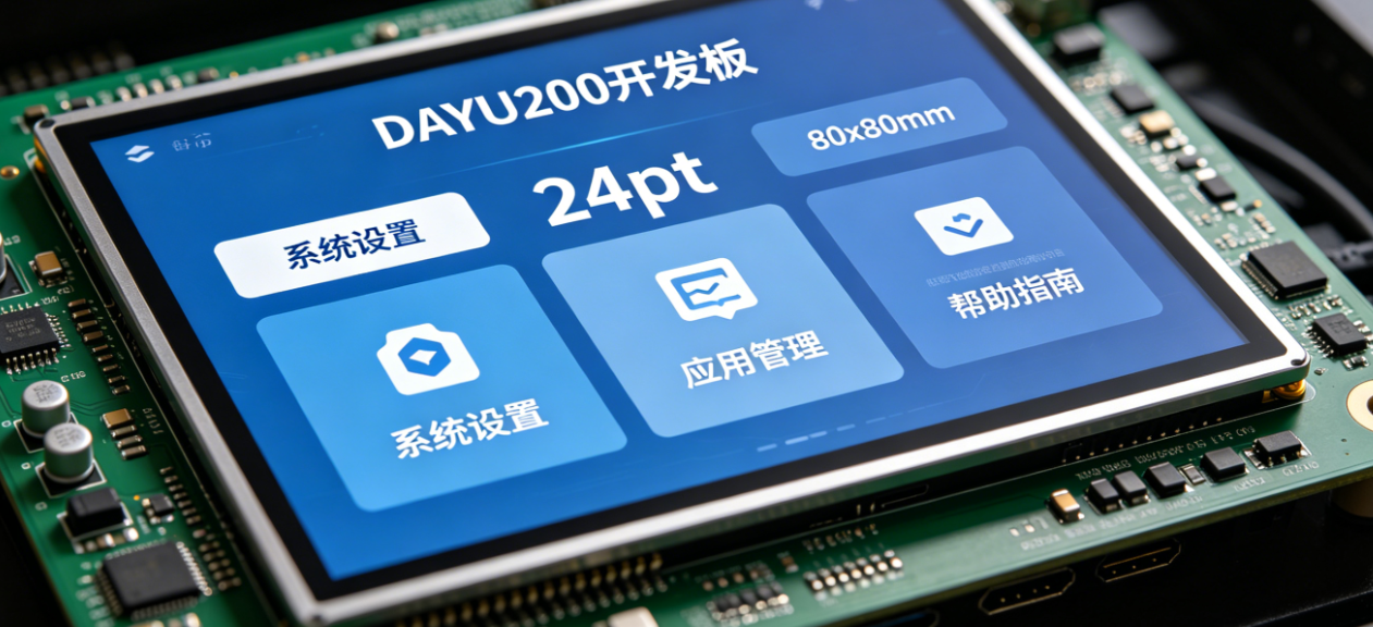
 AI Visual Insight: The image shows layout adaptation results across different device types, highlighting changes in grid column count, font scaling, and whitespace adjustment. Technically, it reflects the use of screen-width breakpoints to control
 crossAxisCount and text size so that phones, tablets, and development boards maintain consistent information density.
The home page assembly phase should implement component reuse and layout strategy together
Once the base components are ready, the home page no longer needs to define repeated UI directly. Instead, it becomes an assembly layer. This keeps the page focused on business entry points and information modules, while style details are pushed down into the component layer.
GridView.count(
  shrinkWrap: true,
  crossAxisCount: isLargeScreen ? 3 : 2, // Switch column count based on device width
  padding: EdgeInsets.all(16.w),
  childAspectRatio: 1.2,
  children: [
    CustomButton(text: '政务服务', onTap: () {}),
    CustomButton(text: '邻里互动', onTap: () {}),
    CustomButton(text: '物业报修', onTap: () {}),
    CustomButton(text: '便民服务', onTap: () {}),
  ],
)
This code completes the reusable assembly of the four core entry points and reduces repeated style definitions in the page layer.
The key to OpenHarmony multi-device adaptation lies in breakpoints, touch targets, and status bar handling
The most valuable part of the original content is not simply that the app can run. It explicitly points out three common pitfalls: empty tablet layouts, weak touch interaction on development boards, and status bar contrast conflicts. These are exactly the engineering details that teams often overlook when Flutter lands on OpenHarmony devices.
The adaptation strategy must explicitly address three device categories
Phones should prioritize compact information density. Tablets should prioritize better space usage. The DAYU200 should prioritize clickability and larger text. Instead of writing one fixed layout, it is better to dynamically control interaction density through screen breakpoints and padding.
GestureDetector(
  onTap: onTap,
  child: Padding(
    padding: EdgeInsets.all(8.w), // Expand the hit area to improve tap success on development boards
    child: Container(),
  ),
);
This code expands the touch target through outer padding and directly improves tap hit rates on OpenHarmony development boards.
Base route configuration reduces coupling for Day 3 page expansion
Although Day 2 does not yet enter full business flows, setting up named routes first is a sensible move. When government service pages, notice detail pages, or login screens are added later, you only need to append mappings in one unified entry point.
class Routes {
  static const String home = '/home';

  static Map<String, WidgetBuilder> routes = {
    home: (context) => const HomePage(), // Register the home route in a unified way
  };
}
This code establishes a minimum viable route table and provides a single entry point for future navigation and module expansion.
 AI Visual Insight: The image shows the relationship between pages and the role of the home page within the overall project. It emphasizes that the home page is not an isolated screen, but the navigation hub for later modules such as government services, interaction, and repairs. Technically, this corresponds to named routing, component reuse, and future integration points for data rendering.
The value delivered on this day is a stable foundation for subsequent feature development
In summary, Day 2 did not just produce a static home page. It delivered a set of Flutter frontend infrastructure patterns for OpenHarmony scenarios: a unified layout skeleton, reusable components, a cross-device adaptation strategy, and an extensible routing entry point.
If you want to continue into Day 3, the most natural next step is to replace the static notice cards with a dynamic data source, connect the four main entry points to real pages, and continue following the component boundaries established today. That is much closer to maintainable engineering practice than rebuilding UI repeatedly.
FAQ
1. Why use GridView.count for home page entry points instead of Row + Column?
Because a grid menu needs to switch column counts dynamically based on screen width. GridView.count is better suited for responsive distribution, produces shorter code, and scales more naturally across phones and tablets.
2. What is the most important value of flutter_screenutil in OpenHarmony adaptation?
It unifies the scaling logic for sizes and font sizes. In particular, it helps solve text that appears too small and spacing that becomes unbalanced on development boards and large-screen devices, making it a foundational tool for multi-device consistency.
3. Why prioritize component encapsulation on Day 2 instead of building business pages directly?
Because elements such as home page modules, forms, and notice cards will appear repeatedly across future pages. Encapsulating them first reduces duplicate code, standardizes the visual language, and lowers long-term maintenance costs.
AI Readability Summary
This article reconstructs the Day 2 development of Smart Community and focuses on four engineering tasks: building the Flutter home page UI for OpenHarmony, extracting reusable global UI components, adapting the experience across phones, tablets, and the DAYU200 development board, and setting up basic named routing. It also summarizes age-friendly design considerations and the most common implementation pitfalls to avoid.