This article focuses on adapting the HdsTabs MiniBar in HarmonyOS 6 API23, solving the challenge of keeping custom areas beside floating bottom navigation consistent in animation, material, and collapse behavior. Core capabilities include floating tabs, MiniBar, and immersive lighting effects. Keywords: HarmonyOS 6, MiniBar, HdsTabs
Technical specifications are easy to review at a glance
| Parameter | Description |
|---|---|
| Platform | HarmonyOS 6.1.0 / API23 |
| Language | ArkTS |
| Core Components | HdsTabs, HdsTabsController |
| UI Protocol | HDS floating tab system |
| Key Capabilities | MiniBar, gradient mask, immersive lighting effects |
| Core Dependency | @kit.UIDesignKit |
| Adaptation Scenario | Mobile floating bottom navigation |
| Stars | Not provided in the original article |
MiniBar is the native extension area for floating bottom navigation
MiniBar is not a developer-built floating Row. It is part of the HdsTabs floating system. It stays the same height as the tab bar, aligns horizontally with it, and supports both expanded and collapsed states.
This means it naturally inherits the floating background, gradient mask, immersive material, and transition animations. Compared with a custom floating layer, MiniBar is a better fit for high-frequency scenarios such as music controls, playback progress, task status, and quick entry points.
You must satisfy three prerequisites before adaptation
First, the tab bar must be placed at the bottom and rendered horizontally. Otherwise, MiniBar will not behave as a floating bottom interaction element.
// Bottom horizontal tabs are required for MiniBar to work
.barPosition(BarPosition.End)
.vertical(false)
This configuration declares that the tabs are placed at the bottom of the container and rendered horizontally.
Second, you must explicitly enable floating overlay so the tab bar sits above the content area instead of participating in the normal document flow.
// Enable floating overlay; otherwise this is just a regular bottom navigation bar
.barOverlap(true)
This setting determines whether TabBar is displayed as a floating layer above TabContent.
The currently supported tab styles have a limited scope
According to the original content, MiniBar currently works primarily with BottomTabBarStyle and CustomBuilder. To reduce compilation risk, the example uses BottomTabBarStyle first.
MiniBar content should prioritize the collapsed state
Developers fully control MiniBar content, but you should place the most important action on the far left whenever possible. When the component collapses, it reduces width by clipping content, so left-side elements are the most likely to remain visible.
@Builder
miniBarBuilder() {
  Row() {
    Column() {
      Image($r('sys.media.ohos_ic_public_play')) // Keep the playback entry visible in the collapsed state
        .width(26)
        .height(26)
        .fillColor('#007DFF')
    }
    .width(48)
    .height(48)
    .justifyContent(FlexAlign.Center)
    .borderRadius(24)
    .backgroundColor('#E8F0FE')

    Column({ space: 2 }) {
      Text('Now Playing')
        .fontSize(12)
      Text('HarmonyOS From Beginner to Expert') // Show full information in the expanded state
        .fontSize(10)
        .maxLines(1)
        .textOverflow({ overflow: TextOverflow.Ellipsis })
    }
    .width(116)
    .alignItems(HorizontalAlign.Start)
  }
  .height(48) // Set height only to avoid breaking collapse width behavior
}
This builder defines a lightweight music controller that fits MiniBar well.
Do not force the root node to full width
If you set .width('100%') on the root node of miniBarBuilder(), you will interfere with MiniBar’s internal collapse logic and make it look as if it never fully collapsed. For that reason, define only the height on the root node and do not force full width.
The HdsTabs integration pattern determines structural stability
MiniBar still uses HdsTabs as its host. In production projects, first make sure your standard tabs render reliably, then add floating styles and MiniBar configuration.
import { HdsTabs, HdsTabsController, hdsMaterial } from '@kit.UIDesignKit'

@Entry
@Component
struct Index {
  private controller: HdsTabsController = new HdsTabsController()
  @State currentTab: number = 0
  @State logText: string = ''
}
This code imports the core components, initializes the controller, and declares the required state.
barFloatingStyle is the primary entry point for MiniBar
The setting that actually enables floating bottom navigation, immersive lighting effects, and MiniBar together is .barFloatingStyle(). It centrally configures tab bar width, bottom margin, mask, material, and MiniBar behavior.
.barFloatingStyle({
  barWidth: { smallWidth: 240, mediumWidth: 300, largeWidth: 360 }, // Responsive tab bar widths
  barBottomMargin: 28, // Creates the floating effect
  gradientMask: { maskColor: '#66F1F3F5', maskHeight: 92 },
  systemMaterialEffect: {
    materialType: hdsMaterial.MaterialType.IMMERSIVE,
    materialLevel: hdsMaterial.MaterialLevel.ADAPTIVE
  },
  miniBar: {
    miniBarBuilder: () => this.miniBarBuilder(),
    miniBarStyle: 1, // Expanded by default
    miniBarWidth: { smallWidth: 240, mediumWidth: 260, largeWidth: 320 },
    enableMiniBarBackground: true, // Keep the background consistent with the tab bar
    enableMiniBarClip: true // Clip content when collapsed to prevent text leakage
  }
})
This configuration defines the visual and interactive behavior of the floating bottom tabs and MiniBar in one place.
Width, material, and clipping strategy together shape the experience
barWidth controls the tab bar width at different device breakpoints, while barBottomMargin preserves bottom spacing to strengthen the floating visual hierarchy. gradientMask smooths the transition between the content area and the floating layer.
systemMaterialEffect uses the IMMERSIVE + ADAPTIVE combination, which works well when you want to stay aligned with system immersive lighting effects. If your project emphasizes a branded UI, you can build theme color coordination on top of this foundation.
The two most common MiniBar mistakes matter the most
First, miniBarWidth controls only the expanded width, and the original content explicitly notes that the maximum should not exceed 328vp. Second, you should almost always keep enableMiniBarClip enabled. Otherwise, text and buttons may overflow while the MiniBar is collapsed.
Event callbacks are the best way to debug collapse and expansion
MiniBar is not static UI. It is a floating area with a state machine. Callback listeners help you verify whether a style change was caused by screen size, user interaction, or application logic.
onBarStyleChange: (
  miniBarStyle: number,
  tabBarStyle: number,
  _miniBarWidth: number,
  _tabBarWidth: number,
  mode: number
) => {
  const modeStr = mode === 0 ? 'NORMAL' : mode === 1 ? 'USER_CLICK' : 'APP_TRIGGER'
  this.appendLog(`MiniBar:${miniBarStyle} TabBar:${tabBarStyle} Mode:${modeStr}`) // Log the source of the state change
}
This callback tracks the source of style changes for both MiniBar and TabBar.
After you add animation start and end callbacks, you can reconstruct the full collapse sequence and diagnose issues such as “tap has no effect” or “state is out of sync.”
private appendLog(msg: string): void {
  const time = new Date().toLocaleTimeString()
  this.logText += `[${time}] ${msg}\n` // Append timestamped logs to inspect event order
}
This method builds a visible event log, which is especially useful for teaching and debugging scenarios.
The images show the actual expanded-state interaction of MiniBar
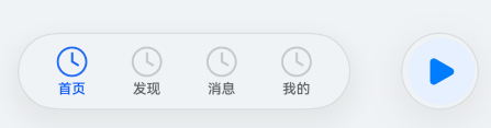 AI Visual Insight: The image shows the final layout with the floating bottom tabs and the left-side MiniBar arranged side by side. MiniBar uses a capsule-style appearance and contains a playback icon, text information, and action buttons. Its height matches the tab bar, which confirms that it belongs to the unified HdsTabs floating layer rather than being a page-drawn floating widget.
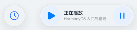 AI Visual Insight: The image further demonstrates MiniBar’s usefulness in a music playback scenario. The key detail is that the primary action icon on the left remains highly visible even under limited width. This validates the design strategy of placing important elements on the left and preserving the primary entry point in the collapsed state.
This solution works well for content-heavy apps that need a strong interactive bottom entry
If your page needs both bottom navigation and a long-lived dynamic task entry point, MiniBar is a safer option than a custom floating layer. It reduces layering conflicts, gesture interference, and inconsistent material treatment.
Combined with floating tabs and immersive lighting effects from the related API23 capabilities, the bottom navigation stack becomes complete: tabs handle primary routing, MiniBar handles secondary high-frequency tasks, and the material system keeps the visual language consistent.
FAQ
Why does my MiniBar look like it never collapses?
Usually this happens for one of two reasons: you set .width('100%') on the root node of miniBarBuilder, or you did not enable enableMiniBarClip: true. The first breaks the internal width contraction logic, and the second allows content to overflow.
Why does the MiniBar not appear even though I configured miniBar?
First, check whether you also set .barPosition(BarPosition.End), .vertical(false), and .barOverlap(true). Without these prerequisites, MiniBar will most likely not run in floating bottom mode.
What kinds of business features fit MiniBar best?
MiniBar works best for high-frequency, lightweight tasks that can restore context with a single tap, such as audio playback, course progress, download status, workout tracking, or quick action entry points. Avoid placing complex forms or multi-level interactions inside it.
[AI Readability Summary]
This article systematically explains the MiniBar capability of
HdsTabsin HarmonyOS 6.1 / API23. It covers integration prerequisites,miniBarBuilderconstruction, corebarFloatingStyleconfiguration, collapse and expansion listeners, and common pitfalls, helping developers ship a floating bottom navigation MiniBar quickly and reliably.