This project uses Tencent Location Services and Trae AI to build a GIS visualization platform for Changsha youth talent apartments. It addresses the limitations of spreadsheet-based data, non-intuitive housing distribution views, and low-efficiency spatial queries, while supporting map markers, nearby search, weather overlays, and chart-based analytics. Keywords: Tencent Location Services, Trae AI, GIS Visualization.
The technical specification snapshot outlines the implementation baseline
| Parameter | Details |
|---|---|
| Primary languages | JavaScript, HTML, Markdown |
| Map protocols/capabilities | Tencent Map JavaScript API GL, POI Search, Geocoder, Weather API |
| Architecture pattern | Pure frontend WebGIS + AI Skill-assisted generation |
| Data sources | Excel housing inventory sheets, multi-row merged-cell business data, third-party location services |
| Business scale | 103 apartment projects, approximately 34,000 to 54,000 units |
| Core dependencies | TMap GL, ECharts, Trae Skill, LLM-based Excel parser |
| Performance targets | Map load ≤ 2s, marker rendering ≤ 1s, query response ≤ 300ms |
| Star count | Not provided in the original content |
This project turns youth talent apartment management into an interactive spatiotemporal interface
Changsha youth talent apartment data naturally combines two dimensions: spatial location and business attributes. Traditional Excel sheets and static charts cannot clearly express the relationship between project locations, housing scale, and nearby amenities. As a result, renters struggle to filter options, and managers struggle to gain a complete overview.
This solution uses Tencent Location Services as the map foundation and Trae AI as the development accelerator. It brings apartment projects, unit layouts, rental policies, nearby facilities, and weather information into a unified interface, forming a closed loop of data, maps, analytics, and interaction.
The core business goals are clearly split into five capability groups
- Display apartment markers and distribution intensity across the city.
- Support search and location by name, district, and address.
- Provide nearby POI search for subway stations, schools, hospitals, and more.
- Overlay real-time weather for Changsha.
- Use charts to display unit layout, area, and district-level statistics.
const requirements = {
  map: true, // Map foundation
  search: true, // Name and district search
  poi: true, // Nearby POI search
  weather: true, // Real-time weather overlay
  charts: true // Unit layout and area analysis
};
This configuration summarizes the platform’s minimum viable capability set and works well as a requirements skeleton when prompting AI to generate the page.
The data processing pipeline determines whether the GIS page is trustworthy
The raw data comes from Excel and includes multi-row merged-cell scenarios: one apartment project often corresponds to multiple unit layouts and multiple housing records. If you render this data directly, you can easily produce duplicate projects, incorrect unit totals, and distorted detail popups.
For that reason, the platform follows a standard GIS data pipeline: collection, cleansing, structuring, geocoding, aggregate statistics, and map service delivery. The core challenge is not simply reading a spreadsheet, but abstracting each project into a spatial object.
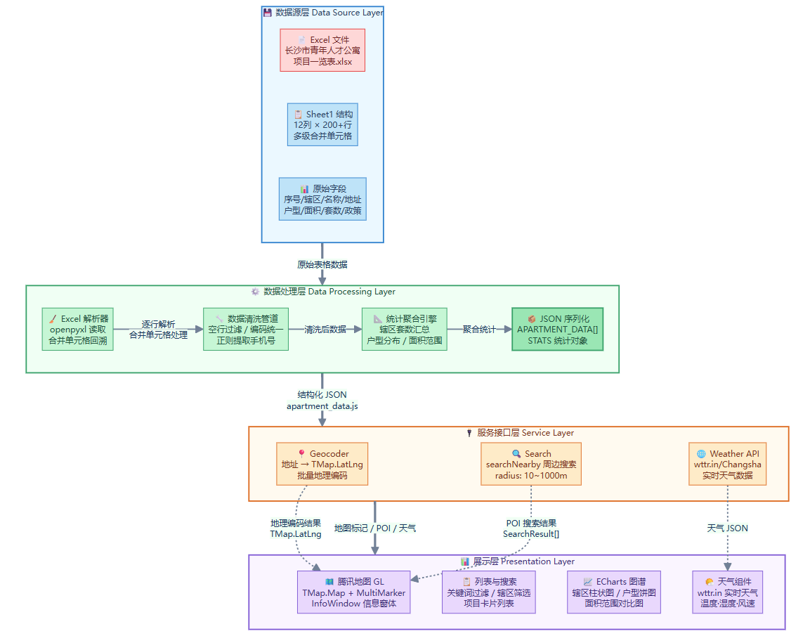 AI Visual Insight: The diagram shows a four-layer architecture from raw Excel sheets to the frontend presentation layer. The bottom layer contains source data, the middle layers handle cleansing, JSON serialization, and statistical aggregation, the next layer connects to Geocoder, POI, and weather APIs, and the final layer uses Tencent Map GL and chart components for visualization. This reflects a typical WebGIS data service pipeline.
The recommended data consolidation model should use the project as the primary entity
function normalizeProjectRows(rows) {
  const projects = new Map();

  rows.forEach((row) => {
    const key = row.project_name; // Use the project name as the consolidation key
    if (!projects.has(key)) {
      projects.set(key, {
        name: row.project_name,
        address: row.address,
        district: row.district,
        policy: row.policy,
        rooms: []
      });
    }

    projects.get(key).rooms.push({
      house_type: row.house_type, // Unit layout information
      units: Number(row.units || 0), // Convert unit count to a number
      area: row.area_range
    });
  });

  return [...projects.values()];
}
This code collapses multiple unit-layout rows into a structure of one project plus multiple room types, which makes the data easier to reuse across lists, charts, and popups.
Trae Skill shifts map development from API orchestration to natural-language orchestration
One key advantage in this case is not just the use of map APIs. It is the packaging of Tencent Maps capabilities into a Skill, allowing AI to directly understand a natural-language request such as “build a visualization platform for Changsha talent apartments.”
The development workflow becomes: upload Excel, mount the Skill, enter the target description, let AI generate the page, and then refine the result by debugging against runtime errors. For business-focused GIS projects, this significantly lowers the barrier to initial implementation.
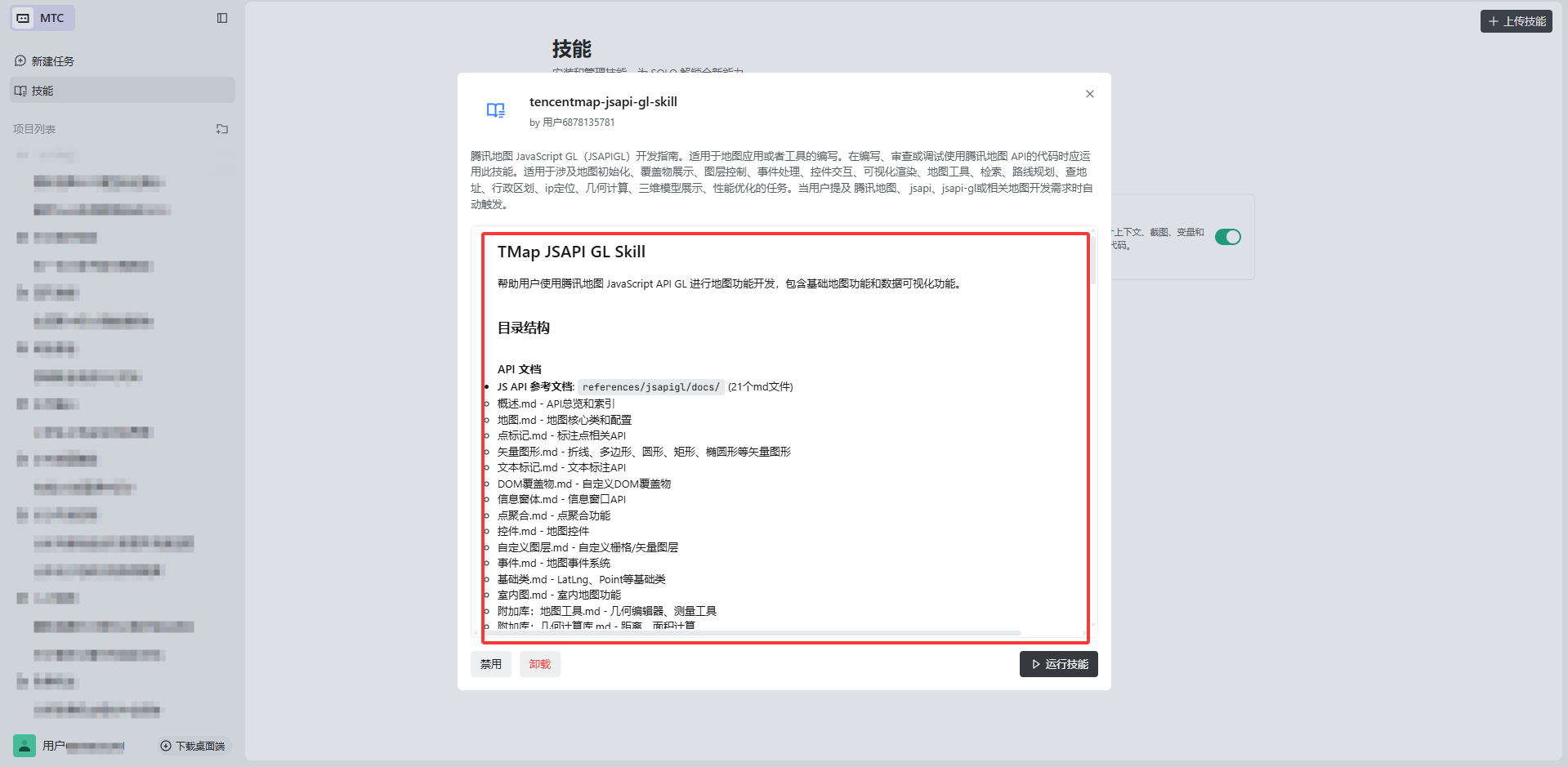 AI Visual Insight: This interface illustrates the skill integration mechanism inside an AI IDE. The key elements include the uploaded Tencent Maps Skill package, visualization configuration items, and entry points for additional extension skills. It shows that map capabilities are not hardcoded into the project, but injected into the AI development workflow as a callable toolchain.
After AI generates the code, the debugging phase becomes the real engineering inflection point
The first generation pass did not succeed in one shot. It produced common issues involving WebGL buffers, InfoWindow DOM parsing, latitude and longitude types, and null-object access. These problems show that AI is good at building the scaffold, but frontend map rendering still requires developers to understand API constraints.
function showInfoWindow(project) {
  if (!project.latLng || !infoWindow) return; // Prevent null-object errors

  infoWindow.setPosition(project.latLng); // Must pass a TMap.LatLng instance
  infoWindow.setContent(`
<div>${project.name}</div>`); // Content must be a parsable DOM string
  infoWindow.open();
}
This fix focuses on three points: check for null first, ensure the position type is correct, and output popup content that the DOM parser can handle.
The frontend rendering layer creates value by turning statistics into interactive feedback
The main map interface uses a classic layout: a list on the left and a map on the right. The list handles filtering and navigation, the map handles spatial expression, and the charts provide global insights. This three-part structure works especially well for scenarios such as public housing, apartments, industrial parks, and logistics nodes.
From an implementation perspective, district color mapping is a low-cost, high-return design choice. It gives users stable visual anchors between the list and the map, improving multi-region project recognition efficiency.
const districtColors = {
  '湘江新区': '#409eff',
  '芙蓉区': '#67c8ff',
  '天心区': '#f0a040',
  '开福区': '#e06060',
  '雨花区': '#50d080',
  '望城区': '#c084fc',
  '长沙县': '#f472b6',
  '宁乡市': '#fbbf24',
  '浏阳市': '#34d399'
};
This mapping assigns a fixed color to each administrative district, creating a unified visual language for list tags, marker styles, and popup borders.
The linkage between the project list and the map is the key usability touchpoint
The list does more than show the project name, address, unit count, and layouts. It also serves as the map navigation entry point. When a user clicks a list item, the interface should highlight the corresponding marker, pan the map, and open the detail popup, avoiding the common GIS interaction gap where users can see an item but cannot effectively select it.
function renderProjectList(data) {
  const container = document.getElementById('projectList');
  container.innerHTML = data.map((p) => {
    const totalUnits = p.rooms.reduce((s, r) => s + (r.units || 0), 0); // Aggregate total units
    return `<div class="project-item" onclick="selectProject(${p.id})">

<div>${p.name}</div>

<div>${p.address}</div>

<div>${totalUnits}套</div>
    </div>`;
  }).join('');
}
This code renders the project list and binds the aggregated unit count and location entry point into a single interactive component.
The final output shows that this approach fits lightweight urban governance visualization
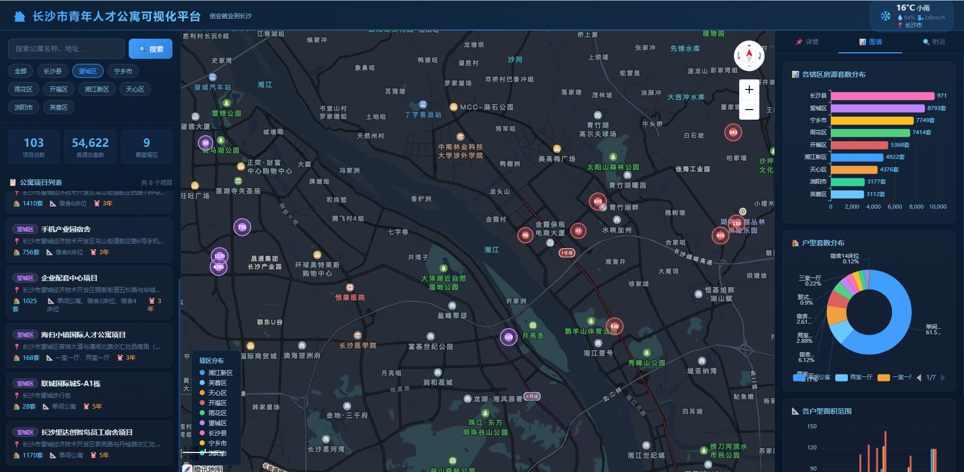
Based on the original results, the platform already supports apartment distribution display, detail popups, district-based filtering, weather overlays, and statistics for unit layouts and districts. In high-supply areas such as Ningxiang, Kaifu District, and Xiangjiang New Area, the map and charts provide strong cross-validation.
This means the platform can serve not only as a housing search tool, but also as an early management dashboard for evaluating supply structure, identifying hotspot areas, and supporting future site selection analysis.
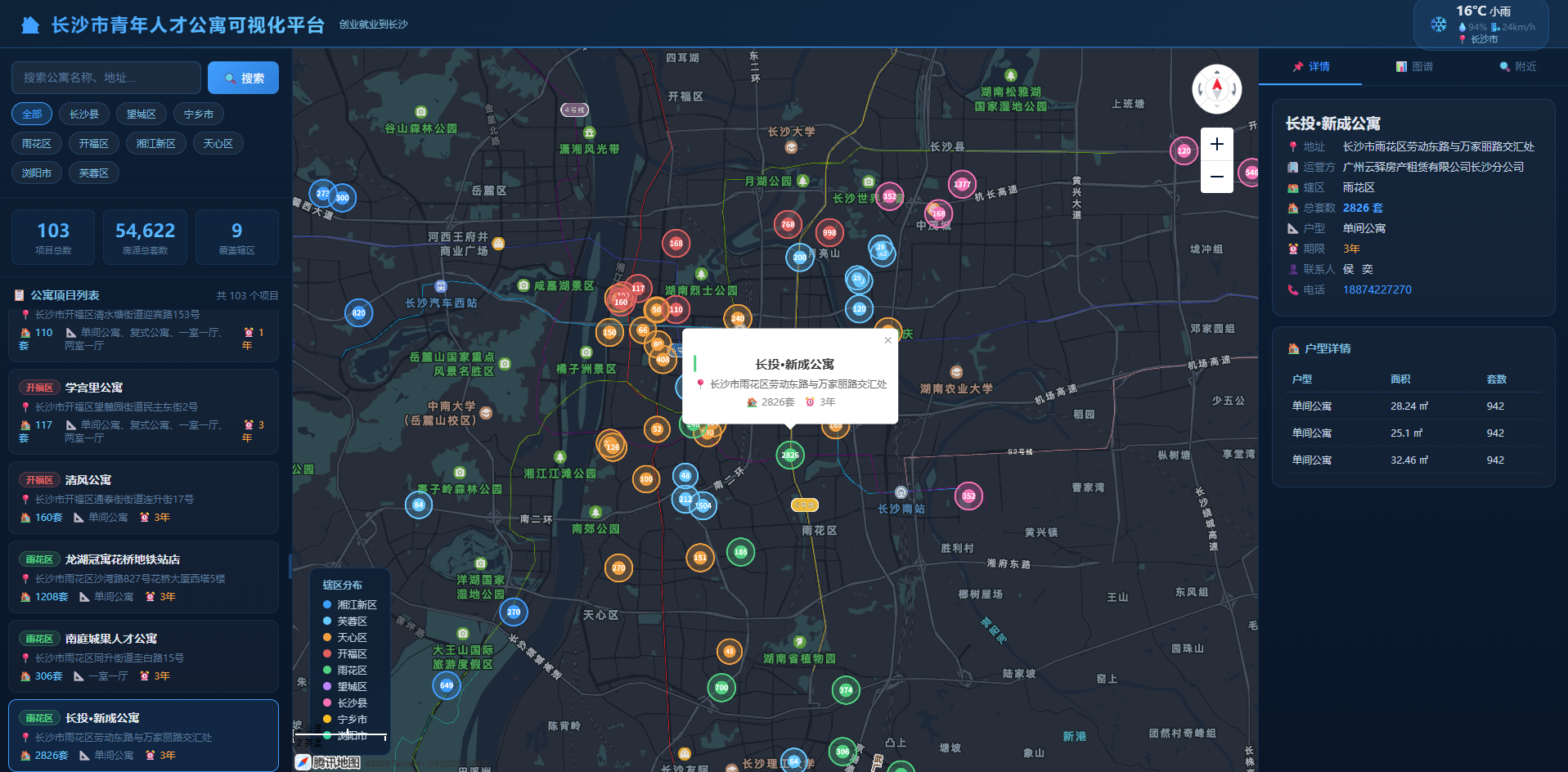 AI Visual Insight: This screenshot shows a standard GIS console layout: filters and the project list on the left, the main Tencent Map canvas in the center, and statistical cards and query controls embedded at the top and in local sections. It indicates that the system has completed an end-to-end loop from data loading to interactive presentation.
 AI Visual Insight: The image shows the spatial distribution of project markers across the Changsha area. High-priority projects are displayed with greater visual weight, while popups carry housing, address, and policy information, reflecting a typical design pattern that links thematic point maps with business details.
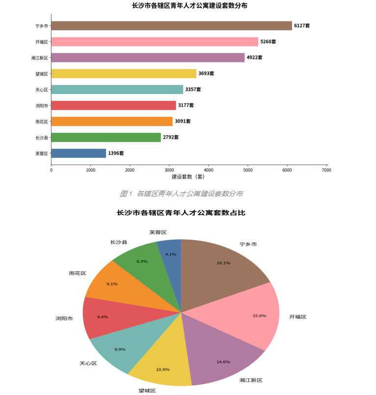 AI Visual Insight: The chart compares housing unit counts across districts in the form of bar charts or sorted rankings. It makes it easy to identify supply concentration areas and low-supply regions, making it useful for regional resource allocation, public housing planning, and rollout pacing analysis.
The reusable conclusions from this case are highly explicit
First, Tencent Location Services is well suited for lightweight WebGIS, especially for business systems centered on markers, POI, geocoding, and interactive popups. Second, Trae AI can significantly shorten page-building time, but human debugging remains essential. Third, the quality of structuring data from Excel into spatial objects directly determines the trustworthiness of the final system.
The next evolution of this solution should focus on recommendations, mobile access, and predictive analytics
If the platform continues to evolve, three capabilities are worth adding: intelligent recommendations based on workplace and budget, mobile mini-program adaptation, and site selection prediction based on transportation and industry data. With these additions, the system can move from a visualization and query tool to an assisted urban housing decision platform.
FAQ
1. Why is this project better suited to Tencent Location Services than a traditional GIS platform?
Tencent Location Services covers common capabilities such as map rendering, geocoding, POI retrieval, and weather overlays, which are enough to support lightweight business GIS. For frontend teams, deployment costs are lower and interaction development is more direct.
2. What is the biggest value of Trae AI in this case?
It compresses what would otherwise be a fragmented process of API calls, page construction, and data wiring into a natural-language-driven generation workflow. That makes it especially effective for prototype validation and rapid delivery of small to medium-sized map applications.
3. What are the most common pitfalls in Excel-driven GIS systems like this one?
The most common issues include duplicate projects caused by merged cells, distorted unit statistics, geocoding failures caused by non-standardized addresses, and mismatches between popup details and list data structures. Consolidation and normalization matter more than drawing the map first.
Core Summary: This article reconstructs a practical WebGIS case built with Tencent Location Services and Trae AI for youth talent apartments. It breaks down the full workflow of data cleansing, map rendering, POI search, weather overlays, and chart analytics, while summarizing debugging practices and reusable code patterns for AI-assisted development.