This article shows how to use ArkTS to implement bottom navigation, multi-page switching, and basic UI polish in OpenHarmony API 20+. It also addresses common issues such as component naming conflicts, type inference problems, and List sizing warnings. Keywords: OpenHarmony, ArkTS, bottom navigation.
Technical Specification Snapshot
| Parameter | Value |
|---|---|
| Language | ArkTS |
| Platform | OpenHarmony / HarmonyOS API 20+ |
| UI Paradigm | ArkUI declarative development |
| Navigation Structure | Bottom tabs + conditionally rendered pages |
| Number of Pages | 3: Home, List, Profile |
| Runtime Environment | DevEco Studio, emulator, or physical device |
| Star Count | Not provided in the original article |
| Core Dependency | OpenHarmony SDK 3.1+ |
| Key Files | entry/src/main/ets/pages/Index.ets, main_pages.json |
This sample project demonstrates the minimum viable bottom navigation architecture in OpenHarmony
The goal of this project is straightforward: use a single main entry to host three pages and switch state through a bottom navigation bar. This approach keeps the structure centralized and the flow easy to follow, which makes it ideal for ArkTS beginners who want to validate page organization quickly.
More importantly, it avoids the reference and validation issues that often appear early when splitting code across multiple files. For developers who are just getting started with Flutter for OpenHarmony or ArkUI, the strategy of “make it run first, then abstract” is more reliable.
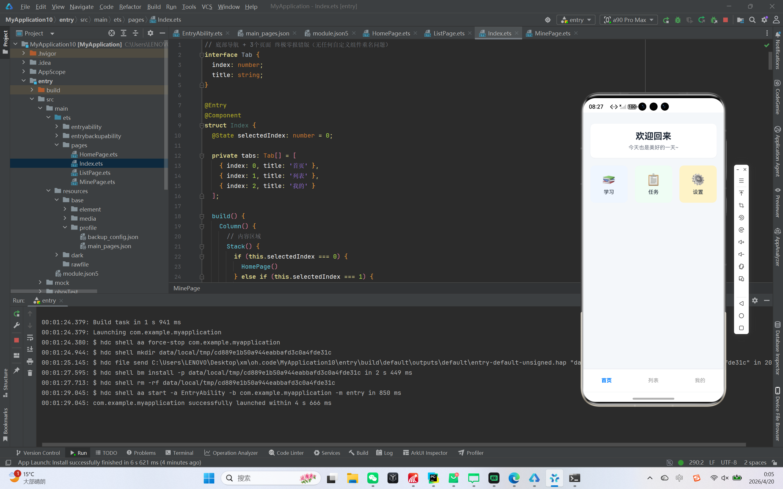 AI Visual Insight: The image shows a card-based home page layout. A welcome card appears at the top, followed by three feature entry modules in the middle. The overall design uses a light gray background, white cards, rounded corners, and soft shadows, demonstrating how ArkUI combines
 Column, Row, borderRadius, and shadow to create polished layouts.
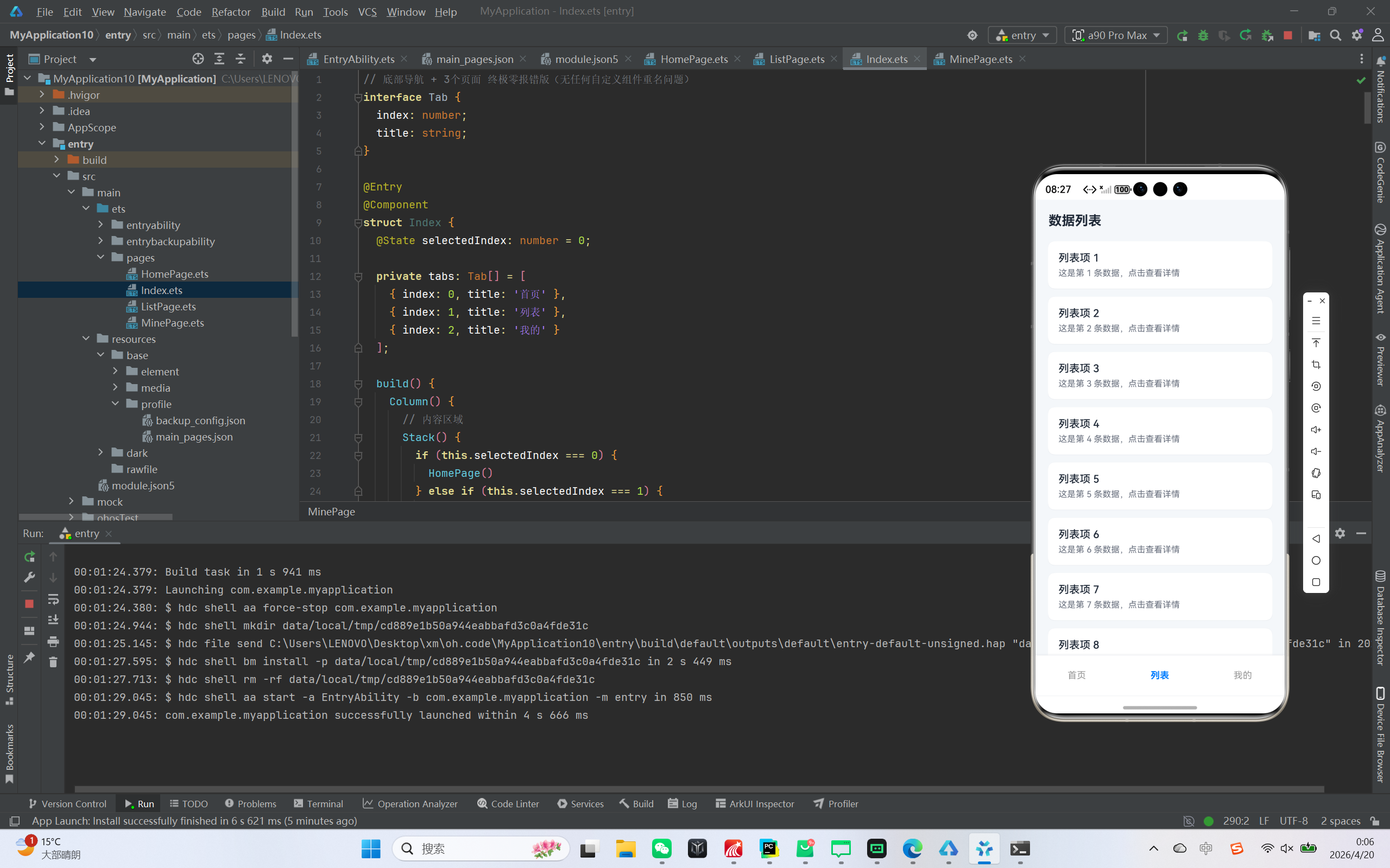 AI Visual Insight: The image shows a vertically scrolling information layout on the list page. A title bar appears at the top, and the main area uses white card-style list items to display titles and descriptions. Each item has rounded corners, margins, and subtle shadows, indicating that the page uses ArkUI
 List and ListItem to build a highly readable data presentation interface.
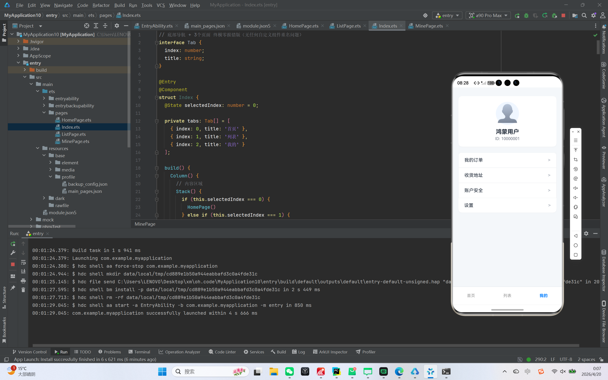 AI Visual Insight: The image shows a typical account panel structure for a profile page. The upper section contains an avatar and user identity card, while the lower section contains multiple menu rows. Technically, this maps to nested
 Column and Row combinations in ArkUI, using Blank().layoutWeight(1) to push the menu title and arrow apart and form a standard settings-style layout.
The development environment and directory constraints should be fixed first
Use the latest stable version of DevEco Studio and make sure the SDK version meets the OpenHarmony 3.1+ requirement. For API 20+ scenarios, you can validate the project on either a physical device or an emulator.
You can keep the project scoped to a single-page entry at first to avoid introducing extra complexity in page registration and component naming. Only two files are essential: the main page Index.ets and the page configuration file main_pages.json.
entry/
├─ src/main/
│  ├─ ets/pages/
│  │  └─ Index.ets   // Main entry and page switching logic
│  └─ resources/base/profile/
│     └─ main_pages.json
This directory structure defines the minimum project boundary and makes it easy to locate the entry file and configuration file.
The main entry handles state switching and bottom navigation rendering
The core of bottom navigation is a selectedIndex state. The page area renders conditionally based on the index, and the navigation bar updates the state through click events, which drives UI switching.
interface Tab {
  index: number;
  title: string;
}

@Entry
@Component
struct Index {
  @State selectedIndex: number = 0; // Currently selected tab

  private tabs: Tab[] = [
    { index: 0, title: '首页' },
    { index: 1, title: '列表' },
    { index: 2, title: '我的' }
  ];

  build() {
    Column() {
      Stack() {
        if (this.selectedIndex === 0) {
          HomePage() // Render the home page
        } else if (this.selectedIndex === 1) {
          ListPage() // Render the list page
        } else {
          MinePage() // Render the profile page
        }
      }
      .width('100%')
      .layoutWeight(1)

      Row() {
        ForEach(this.tabs, (tab: Tab) => {
          Column() {
            Text(tab.title)
              .fontSize(14)
              .fontColor(this.selectedIndex === tab.index ? '#007DFF' : '#999999')
          }
          .width('33.3%')
          .height(60)
          .justifyContent(FlexAlign.Center)
          .onClick(() => {
            this.selectedIndex = tab.index; // Switch pages after click
          })
        })
      }
      .width('100%')
      .height(60)
      .backgroundColor(Color.White)
    }
    .width('100%')
    .height('100%')
    .backgroundColor('#F5F7FA')
  }
}
This code completes navigation state management, content area switching, and bottom bar highlight control.
The home page module works well for aggregated entry points and welcome cards
The home page uses a card-based design, which makes it suitable as an information aggregation panel for an app. In ArkUI, Column({ space: 20 }) can directly create a stable vertical spacing system and reduce unnecessary nesting noise.
@Component
struct HomePage {
  build() {
    Column({ space: 20 }) {
      Column() {
        Text('欢迎回来') // Top welcome message
          .fontSize(24)
          .fontWeight(FontWeight.Bold)
        Text('今天也是美好的一天~')
          .fontSize(14)
          .fontColor('#6B7280')
          .margin({ top: 8 })
      }
      .width('90%')
      .padding(20)
      .backgroundColor(Color.White)
      .borderRadius(12)

      Row({ space: 15 }) {
        Text('📚 学习')
        Text('📋 任务')
        Text('⚙️ 设置')
      }
      .width('90%')
      .justifyContent(FlexAlign.SpaceBetween)
    }
    .width('100%')
    .height('100%')
    .padding({ top: 30 })
  }
}
This code implements a two-layer information structure for the home page: a welcome section and a feature entry section.
The key to the list page is not data volume, but complete List constraints
In the original example, the list page displays 20 mock records. The key point is not business complexity, but ArkTS requirements for List size constraints. If you do not set width and height explicitly, you will often receive warnings during development.
@Component
struct ListPage {
  build() {
    Column() {
      Row() {
        Text('数据列表') // Page title
          .fontSize(20)
          .fontWeight(FontWeight.Bold)
      }
      .width('100%')
      .padding({ left: 20, top: 20, bottom: 10 })

      List({ space: 12 }) {
        ForEach([1, 2, 3, 4, 5], (item: number) => {
          ListItem() {
            Column() {
              Text('列表项 ' + item) // Primary title
              Text('这是第 ' + item + ' 条数据,点击查看详情') // Secondary title
                .fontSize(13)
                .fontColor('#6B7280')
                .margin({ top: 6 })
            }
            .width('100%')
            .padding(16)
            .backgroundColor(Color.White)
            .borderRadius(10)
          }
        }, (item: number) => item.toString())
      }
      .width('90%')
      .height('80%') // Explicit size to avoid warnings
      .layoutWeight(1)
      .margin({ top: 10 })
    }
    .width('100%')
    .height('100%')
  }
}
This code demonstrates the list page title area, data iteration, and the correct way to define List size constraints.
The profile module is better built with a stable, direct layout
The common problem with a profile page is not UI complexity. Instead, developers often over-abstract reusable menu components and accidentally conflict with system-reserved names. In this example, hardcoding the menu is a practical solution.
@Component
struct MinePage {
  build() {
    Column({ space: 20 }) {
      Column() {
        Text('👤') // User avatar placeholder
          .fontSize(60)
        Text('鸿蒙用户')
          .fontSize(20)
          .fontWeight(FontWeight.Bold)
      }
      .width('90%')
      .padding(20)
      .backgroundColor(Color.White)
      .borderRadius(12)

      Column() {
        Row() {
          Text('我的订单')
          Blank().layoutWeight(1) // Push the arrow to the right
          Text('>')
        }
        .padding(16)

        Row() {
          Text('设置')
          Blank().layoutWeight(1)
          Text('>')
        }
        .padding(16)
      }
      .width('90%')
      .backgroundColor(Color.White)
      .borderRadius(12)
    }
    .width('100%')
    .height('100%')
    .padding({ top: 30 })
  }
}
This code builds a typical “My” page structure with a user card and a menu section.
The page configuration must declare only valid entry points
main_pages.json should keep only the real entry page. Otherwise, ArkTS validation can easily report invalid page declarations or registration conflicts.
{
  "src": [
    "pages/Index"
  ]
}
This configuration ensures that the application starts only from the Index page and avoids redundant page declarations.
Three common issues determine whether this sample is production-usable as a starter
First, avoid using reserved component names such as ListItem and MenuItem as custom struct names. Otherwise, you will trigger reserved tag conflict errors.
Second, prefer array literals when generating arrays, or explicitly annotate callback parameter types. ArkTS type inference is not always stable for certain array construction patterns.
Third, provide complete width and height information for key layout components such as List and Stack whenever possible. This removes warnings and also makes page behavior more predictable across devices.
This project works well as a starter template for bottom navigation, page organization, and ArkTS validation
From an engineering perspective, this sample covers five core areas: navigation, layout, lists, cards, and configuration. It is not a complex architecture, but it works extremely well as a startup template for OpenHarmony UI projects.
You can extend it later with icon navigation, secondary routing, network data integration, and event-based navigation, gradually evolving this minimal sample into a real production application.
FAQ
Q1: Why is it recommended to place all three pages in one entry file first?
A: Because early ArkTS development is more likely to hit problems with cross-file references, page registration, and naming. Implementing everything in Index.ets first reduces project complexity and lets you validate navigation and layout logic before refactoring.
Q2: Why must the List component define width and height explicitly?
A: This is an ArkUI requirement for defining the rendering boundary of list containers. Without clear dimensions, the system may emit warnings and, in some cases, affect scroll regions and layout stability.
Q3: How can the bottom navigation evolve into a more complete business architecture later?
A: Start by adding icons and selected-state animations, then split pages into separate files, and finally integrate routing, network requests, and state management. A practical path is to follow this progression: make it run first, then abstract, then decouple.
AI Readability Summary
This article rebuilds a bottom navigation app in ArkTS for OpenHarmony API 20+, covering the implementation of a home page, list page, and profile page. It explains the main entry, page switching, list rendering, and page configuration, and summarizes common ArkTS errors and the best ways to avoid them.