This article focuses on adapting and applying the Flutter third-party package shimmer on OpenHarmony. It is used to build skeleton loading animations that reduce blank-screen waiting, layout shifts, and perceived lag. The key takeaway is simple: it is pure Dart, has zero platform dependencies, and can be reused directly. Keywords: Flutter, OpenHarmony, skeleton screen.
Technical Specifications at a Glance
| Parameter | Description |
|---|---|
| Core library | shimmer |
| Language | Dart / Flutter |
| Target platform | OpenHarmony / HarmonyOS scenarios |
| Platform dependency | None; pure Dart implementation |
| Recommended version | shimmer: ^3.0.0 |
| License | Not explicitly stated in the source material |
| GitHub stars | Not provided in the source material |
| Core capabilities | Skeleton screens, shimmer animation, gradient direction control |
| Typical scenarios | Chat lists, detail pages, product grids |
shimmer Adapts to OpenHarmony with Minimal Effort
The value of shimmer is not that the animation looks flashy. Its real value is that it keeps the page structure stable during loading. Compared with a blank screen or a single loading spinner, it reveals the content outline in advance and reduces user anxiety while waiting.
For OpenHarmony, this package has almost no porting barrier. The reason is straightforward: it is built on Flutter’s rendering system and does not depend on Android or iOS native channels, so it does not introduce extra platform adaptation code.
dependencies:
  flutter:
    sdk: flutter
  shimmer: ^3.0.0 # Add the skeleton screen package
This configuration adds shimmer to a Flutter project. On OpenHarmony, you typically do not need any additional bridging.
The Core Principle of a Skeleton Screen Is That the child Acts as the Clipping Canvas
Shimmer does not automatically infer your page structure. The child actually determines the final visual shape. In other words, container size, corner radius, spacing, and layout all directly affect the resulting skeleton effect.
If the child does not have explicit width and height, the shimmer area may not be visible. This is also the root cause of many cases where the code compiles without errors but shows no visible effect.
import 'package:flutter/material.dart';
import 'package:shimmer/shimmer.dart';

Widget buildBasicSkeleton() {
  return Shimmer.fromColors(
    baseColor: Colors.grey[300]!, // Base color of the skeleton
    highlightColor: Colors.grey[100]!, // Highlight color of the shimmer sweep
    child: Container(
      width: 200, // Explicit dimensions are required
      height: 100,
      decoration: BoxDecoration(
        color: Colors.white, // This will actually be covered by the gradient
        borderRadius: BorderRadius.circular(8),
      ),
    ),
  );
}
This example shows the smallest runnable skeleton screen and is also the fastest way to verify that OpenHarmony adaptation works correctly.
Chat-Style Pages Are the Best First Candidates for shimmer
Chat lists are one of the highest-value use cases for skeleton screens because avatars, names, summaries, and timestamps usually follow a fixed structure. That makes them ideal for reconstructing the real layout quickly with circular and rectangular placeholders.
The key to a list skeleton is not whether it looks identical. The key is whether it stays stable. Width and height should be as close as possible to the real content so the interface does not noticeably jump when the data arrives.
class MessageListSkeleton extends StatelessWidget {
  const MessageListSkeleton({super.key});

  @override
  Widget build(BuildContext context) {
    return ListView.builder(
      itemCount: 6, // Control the number of placeholders
      padding: const EdgeInsets.all(16),
      itemBuilder: (_, __) => Shimmer.fromColors(
        baseColor: Colors.grey[300]!,
        highlightColor: Colors.grey[100]!,
        child: Padding(
          padding: const EdgeInsets.only(bottom: 16),
          child: Row(
            children: [
              Container(
                width: 48,
                height: 48,
                decoration: const BoxDecoration(
                  color: Colors.white,
                  shape: BoxShape.circle,
                ),
              ),
              const SizedBox(width: 12),
              Expanded(
                child: Column(
                  crossAxisAlignment: CrossAxisAlignment.start,
                  children: [
                    Container(width: 100, height: 16, color: Colors.white),
                    const SizedBox(height: 8),
                    Container(height: 14, color: Colors.white),
                    const SizedBox(height: 6),
                    Container(width: 200, height: 14, color: Colors.white),
                  ],
                ),
              ),
            ],
          ),
        ),
      ),
    );
  }
}
This code builds a reusable skeleton component for a chat list.
Detail Pages and Product Grids Require Different Skeleton Strategies
Chat detail pages emphasize the visual difference between left and right message bubbles. Product lists rely more on separating the image area, title area, and price area into distinct layers. Do not try to use a single skeleton template to cover every page.
In a product grid, childAspectRatio and the image area height are especially important. They directly determine the visual consistency between the loading state and the real product cards.
class ProductGridSkeleton extends StatelessWidget {
  const ProductGridSkeleton({super.key});

  @override
  Widget build(BuildContext context) {
    return Shimmer.fromColors(
      baseColor: Colors.grey[300]!,
      highlightColor: Colors.grey[100]!,
      child: GridView.builder(
        padding: const EdgeInsets.all(16),
        gridDelegate: const SliverGridDelegateWithFixedCrossAxisCount(
          crossAxisCount: 2, // Two-column grid
          childAspectRatio: 0.7,
          crossAxisSpacing: 12,
          mainAxisSpacing: 12,
        ),
        itemCount: 6,
        itemBuilder: (_, __) => Container(
          padding: const EdgeInsets.all(8),
          decoration: BoxDecoration(
            color: Colors.white,
            borderRadius: BorderRadius.circular(12),
          ),
          child: Column(
            crossAxisAlignment: CrossAxisAlignment.start,
            children: [
              Container(height: 120, color: Colors.white), // Product image placeholder
              const SizedBox(height: 8),
              Container(height: 14, color: Colors.white), // First title line
              const SizedBox(height: 6),
              Container(width: 80, height: 14, color: Colors.white),
              const SizedBox(height: 8),
              Container(width: 60, height: 18, color: Colors.white), // Price
            ],
          ),
        ),
      ),
    );
  }
}
This example demonstrates a common skeleton layout breakdown for an e-commerce grid page.
State Transitions Must Be Bound to the Data Loading Lifecycle
A skeleton screen is not an isolated feature. It is part of the page state machine. The most common pattern is simple: show the skeleton when the page opens, then switch to the real content after the request finishes.
If you switch abruptly, the UI can feel flickery. A safer approach is to pair it with AnimatedSwitcher so the transition fades smoothly.
class ChatListPage extends StatefulWidget {
  const ChatListPage({super.key});

  @override
  State
<ChatListPage> createState() => _ChatListPageState();
}

class _ChatListPageState extends State
<ChatListPage> {
  bool _isLoading = true;

  Future
<void> _loadChats() async {
    setState(() => _isLoading = true); // Enter the loading state
    await Future.delayed(const Duration(seconds: 2)); // Simulate a request
    setState(() => _isLoading = false); // Switch back to real content
  }

  @override
  Widget build(BuildContext context) {
    return AnimatedSwitcher(
      duration: const Duration(milliseconds: 300),
      child: _isLoading
          ? const MessageListSkeleton(key: ValueKey('skeleton'))
          : const Placeholder(key: ValueKey('content')),
    );
  }
}
This code shows the standard way to connect shimmer to the page loading state.
Theme Adaptation and Animation Parameters Determine the Final Experience
One of the most valuable conclusions from the source material is dark mode adaptation. The default light gray palette often lacks visibility in Dark Mode, so you should dynamically adjust baseColor and highlightColor based on theme brightness.
You can also customize gradient direction by scenario. For example, lists often use a left-to-right sweep, while waterfall feeds or card flows may benefit from vertical motion. Still, avoid overusing motion because it can introduce visual noise.
Shimmer.fromColors(
  baseColor: Theme.of(context).brightness == Brightness.dark
      ? Colors.grey[700]!
      : Colors.grey[300]!, // Handle dark and light themes separately
  highlightColor: Theme.of(context).brightness == Brightness.dark
      ? Colors.grey[600]!
      : Colors.grey[100]!,
  child: child,
)
This snippet solves the issue of insufficient skeleton contrast on OpenHarmony devices in dark theme.
Visual Validation Shows That This Approach Reuses Well Across Multiple Scenarios
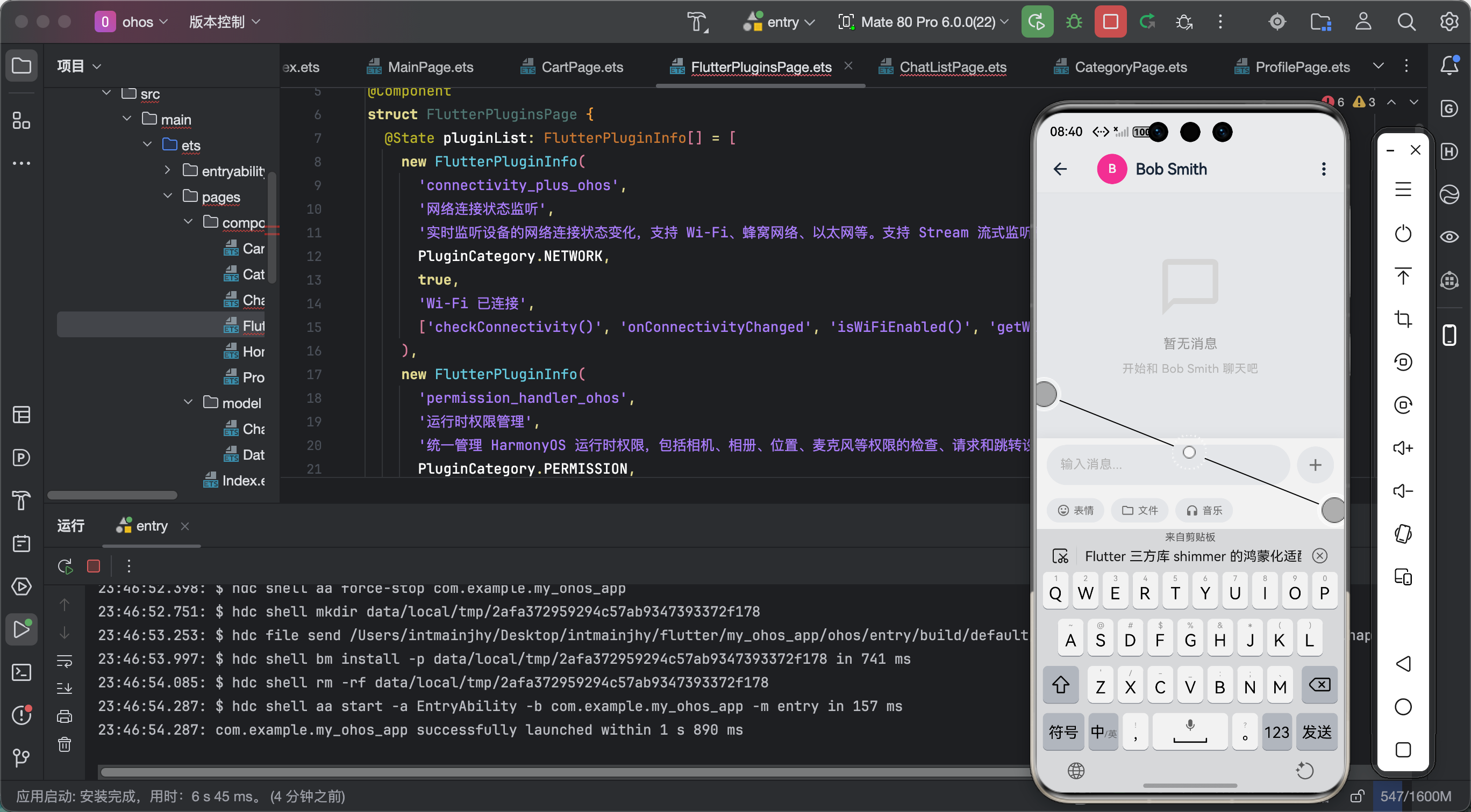 AI Visual Insight: The image shows the shimmer loading effect in a real page. Multiple list or card placeholders use a consistent grayscale gradient, which indicates that shimmer is driving the gradient animation correctly. The dimensions of the rectangular and rounded modules are close to the real content areas, which effectively reduces the perceived reflow when data finishes loading. This validates the solution’s versatility across lists, detail pages, and product display scenarios.
From the result, shimmer’s core advantage on OpenHarmony is not just compatibility. It is low-cost, scalable reuse. As long as the page structure is clear, you can quickly abstract the corresponding skeleton component.
FAQ
Q1: Why can shimmer run on OpenHarmony with almost zero modifications?
Because it is implemented entirely in Dart and does not rely on native platform code or Method Channels. Flutter’s rendering layer can drive its animation logic directly, so OpenHarmony usually does not require separate adaptation.
Q2: Why is my skeleton screen not showing or rendering incorrectly?
The most common reason is that the child does not have explicit dimensions, so the gradient cannot be clipped correctly. Another common cause is insufficient contrast between the colors and the current theme. A third cause is conflict with existing page animations, which can hurt the overall visual effect.
Q3: Should skeleton screens cover every page?
Usually no. Prioritize pages with noticeable request latency, stable layout structure, and high user sensitivity, such as home lists, chat feeds, product lists, and above-the-fold detail content. That gives you the best return on implementation effort.
AI Readability Summary
This article reconstructs the key adaptation points and practical implementation patterns for shimmer in Flutter for OpenHarmony scenarios. It covers dependency setup, basic skeleton screen implementation, examples for chat lists, detail pages, and product grids, as well as state transitions, theme adaptation, and common pitfalls. The conclusion is that this pure Dart package can be integrated into OpenHarmony at very low cost.