This article focuses on two high-frequency UI capabilities for Flutter on OpenHarmony: optimizing button layouts on a user profile page and implementing global font size adjustment. It addresses common pain points such as overflow on small screens, ineffective global scaling, and non-persistent settings. Keywords: OpenHarmony, Flutter, Provider.
Technical Specifications at a Glance
| Parameter | Details |
|---|---|
| Programming Language | Dart |
| UI Framework | Flutter |
| Target Platforms | OpenHarmony / Windows |
| State Management | provider 6.1.1 |
| Local Storage | shared_preferences 2.5.3 |
| Core Capabilities | Compact button layout, global font scaling, real-time preview, persistence |
| Validation Method | Windows runtime + OpenHarmony virtual machine verification |
| Original Article Metrics | 118 views, 4 likes, 3 saves |
This article implements a reusable cross-platform UI optimization solution
The original implementation focused on two issues: overly wide buttons on the user profile page causing overflow on small screens, and the lack of a unified font scaling capability across the app. The former affects readability, while the latter directly impacts accessibility and personalization.
The core idea is to upgrade page-level fixes into global capabilities. For button layout, use Row + Expanded + circular icon buttons to reduce horizontal space usage. For font size, use Provider + MaterialApp.textScaleFactor + SharedPreferences to enable global scaling and persistent local storage.
Compatible dependency selection should prioritize OpenHarmony stability
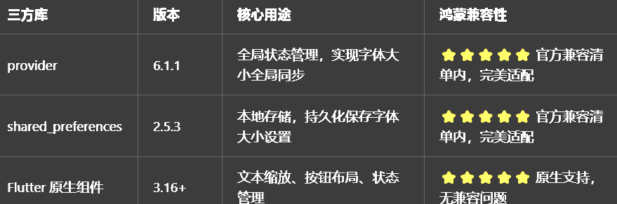 AI Visual Insight: This image shows the dependency compatibility screening criteria used in Flutter for OpenHarmony development. It highlights the importance of prioritizing stable versions listed in the compatibility matrix to reduce adaptation risks for Provider, storage plugins, and theme-related capabilities in the OpenHarmony runtime.
In scenarios like this, the goal is not to chase the newest library features, but to maximize stability, reusability, and low migration cost. On OpenHarmony devices, conservative dependency selection is often more important than aggressive upgrades.
The key to button layout optimization is reducing the visual weight of secondary actions
The original page designed “Follow,” “Homepage,” and “Share” all as text-and-icon buttons, which quickly consumed horizontal space. On small-screen devices or when the system font size increases, text overflow becomes even more likely.
The optimization strategy is straightforward: keep “Follow” as the primary action with both text and icon, and downgrade “Homepage” and “Share” into icon-only circular buttons. This preserves recognizability while significantly reducing layout width.
Row(
  children: [
    Expanded(
      child: ElevatedButton.icon(
        onPressed: () {},
        icon: const Icon(Icons.add),
        label: const Text('关注'), // Keep text for the primary action to improve semantics
        style: ElevatedButton.styleFrom(
          padding: const EdgeInsets.symmetric(vertical: 12),
        ),
      ),
    ),
    const SizedBox(width: 12),
    Container(
      width: 48,
      height: 48,
      decoration: BoxDecoration(
        color: Theme.of(context).colorScheme.primary.withOpacity(0.1),
        shape: BoxShape.circle, // Convert secondary actions into circular icon buttons
      ),
      child: Icon(
        Icons.home_outlined,
        color: Theme.of(context).colorScheme.primary,
      ),
    ),
    const SizedBox(width: 12),
    Container(
      width: 48,
      height: 48,
      decoration: BoxDecoration(
        color: Theme.of(context).colorScheme.primary.withOpacity(0.1),
        shape: BoxShape.circle,
      ),
      child: Icon(
        Icons.share_outlined,
        color: Theme.of(context).colorScheme.primary,
      ),
    ),
  ],
)
This code presents primary and secondary actions in distinct layers, eliminating text overflow without sacrificing action recognition.
This layout strategy naturally fits dark mode and multiple screen sizes
Because secondary actions are converted into icon containers, their colors can directly follow colorScheme.primary with a translucent background. This means you do not need to maintain separate style sets for light and dark modes.
At the same time, the primary button is wrapped in Expanded, allowing it to flexibly occupy the remaining space and adapt better to OpenHarmony phones, tablets, and desktop windows.
Global font adjustment should be managed centrally by the state layer
In many projects, font scaling fails not because the logic is complicated, but because the state is injected at the wrong level. If ChangeNotifierProvider does not wrap MaterialApp, child widgets may update state successfully but still fail to drive global text scaling.
A recommended approach is to centralize the font enum, scale factors, display names, and persistence logic inside FontSizeProvider. That way, pages only consume state and do not directly own configuration management.
import 'package:flutter/material.dart';
import 'package:shared_preferences/shared_preferences.dart';

enum FontSize { small, medium, large, extraLarge }

class FontSizeProvider extends ChangeNotifier {
  FontSize _currentSize = FontSize.medium;
  static const String _storageKey = 'font_size_index';

  static const Map<FontSize, double> _scaleFactors = {
    FontSize.small: 0.85,
    FontSize.medium: 1.0,
    FontSize.large: 1.15,
    FontSize.extraLarge: 1.3,
  };

  double get scaleFactor => _scaleFactors[_currentSize]!;
  FontSize get currentSize => _currentSize;

  FontSizeProvider() {
    _loadSettings(); // Automatically restore user settings on startup
  }

  Future
<void> setFontSize(FontSize size) async {
    if (_currentSize == size) return;
    _currentSize = size;
    notifyListeners(); // Refresh the UI first, then persist asynchronously
    await _saveSettings();
  }

  Future
<void> _saveSettings() async {
    final prefs = await SharedPreferences.getInstance();
    await prefs.setInt(_storageKey, _currentSize.index);
  }

  Future
<void> _loadSettings() async {
    final prefs = await SharedPreferences.getInstance();
    final index = prefs.getInt(_storageKey);
    if (index != null && index >= 0 && index < FontSize.values.length) {
      _currentSize = FontSize.values[index];
      notifyListeners(); // Notify global rebuild after restoring settings
    }
  }
}
This code defines font state, scaling mappings, and local persistence. It serves as the core hub of the global font feature.
The critical integration point for global font scaling is MaterialApp
One of the most common mistakes is adjusting the font size only on a few individual Text widgets. That approach creates inconsistent scaling behavior across the app and is difficult to maintain.
A more stable solution is to bind textScaleFactor to the scale value exposed by Provider, so the default text system inherits a unified multiplier automatically.
return ChangeNotifierProvider(
  create: (context) => FontSizeProvider(),
  child: Consumer
<FontSizeProvider>(
    builder: (context, fontSizeProvider, child) {
      return MaterialApp(
        title: '开发者社区',
        debugShowCheckedModeBanner: false,
        themeMode: ThemeMode.system,
        textScaleFactor: fontSizeProvider.scaleFactor, // Global text scaling entry point
        home: const SplashPage(),
      );
    },
  ),
);
This code promotes font adjustment into an application-level capability, ensuring that pages, dialogs, and title text scale as consistently as possible.
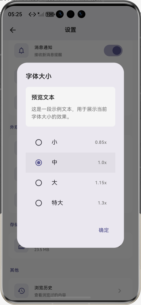
The settings page should provide immediate feedback instead of blind configuration
A good font setting is not just editable. It should also be previewable. For that reason, the settings page should include a preview container so users can immediately see the effect when selecting “Small,” “Medium,” “Large,” or “Extra Large.”
At the same time, the settings item subtitle can directly display the current font size name, reducing cognitive load and improving discoverability.
_buildJumpItem(
  icon: Icons.format_size_outlined,
  title: '字体大小',
  subtitle: context.watch
<FontSizeProvider>().currentSize.name, // Display the current state in real time
  onTap: () => _showFontSizeDialog(),
)
This code displays the current font state at the settings entry point, creating an interaction loop where the entry itself provides feedback.
The value of this solution for OpenHarmony adaptation lies in low permissions and low intrusion
The entire solution only involves UI structure, state synchronization, and lightweight storage. It does not depend on system permissions or require changes to complex native bridge logic. For Flutter for OpenHarmony projects, this means a low adoption barrier and manageable migration cost.
You can install dependencies and run the project as follows:
dependencies:
  flutter:
    sdk: flutter
  provider: ^6.1.1
  shared_preferences: ^2.5.3

# Install dependencies
flutter pub get

# Run on Windows
flutter run -d windows

# Run on an OpenHarmony device
flutter run -d ohos
These dependencies and commands let you quickly integrate the required packages and verify cross-platform behavior.
Virtual machine verification shows that this solution is ready for real deployment
 AI Visual Insight: This image shows the app running in full-screen mode inside an OpenHarmony virtual machine. The page layout remains stable, the text renders correctly, and no scaling misalignment appears in the UI. This confirms through visual validation that Provider-driven global text scaling and page layout both work correctly in the OpenHarmony runtime.
From the results, the buttons no longer overflow, font switching is smooth, and settings persist after restart. This shows that the implementation is suitable not only for tutorials, but also for real production projects.
This implementation captures reusable experience for Flutter OpenHarmony projects
First, solve UI issues through information hierarchy and layout refactoring before resorting to shrinking font sizes without limits. Second, inject global configuration at the application entry point. Third, persistence should work in tandem with state management instead of acting as an after-the-fact patch.
If you continue evolving this solution, you can add custom scale ratios, line height adjustment, font family switching, and breakpoint-based layout strategies for tablets and desktop environments.
FAQ
Why does changing the font size only affect part of the text?
This usually happens because textScaleFactor is not bound to MaterialApp, or some components are outside the Provider listening tree. Start by checking the wrapper hierarchy at the application entry point.
Why are the font settings lost after restarting the app?
Common causes include not loading local settings in the Provider constructor, inconsistent storage keys, or saving the wrong value. A reliable approach is to store the enum index for the selected font size.
Why does the button layout still feel crowded on small screens?
That usually means primary and secondary actions are not properly separated, or the primary button is not wrapped in Expanded. Keep text on the core button, convert secondary buttons to icon-based controls, and strictly manage fixed size and spacing.
AI Readability Summary: Based on Flutter for OpenHarmony, this article rebuilds a user profile page button layout and a global font size adjustment solution. It covers Provider state management, SharedPreferences persistence, real-time preview, light and dark theme adaptation, and virtual machine verification. It is well suited for developers who need to quickly ship cross-platform UI optimizations on OpenHarmony.